The audience of VKontakte, according to the social network, is 97 million unique users, 77% of whom log in from mobile devices. Advertising can be displayed in mobile and desktop versions of the social network, as well as in VKontakte applications.
Using targeted ads, you can advertise several types of objects: communities and applications on VKontakte, external sites and community posts.
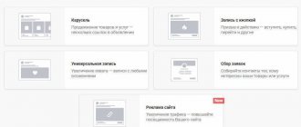
We will look at four main advertising formats:
- text and graphic advertisements;
- promotion of records;
- advertising posts with a button;
- advertising carousel.
Read about how to run advertising on a social network in our other material.
Tips for creating a VKontakte publication
This method allows you to use any type of attachment for a total of up to 10 images, videos, messages, surveys.
Images:
- The size should start from a resolution of 510X510 pixels.
- If the photo is rectangular then the sides should be 3:2.
- The maximum image resolution is up to 1000x700 pixels.
- It is better to take a picture for the cover of a publication with a size of 510x286 pixels.
- The snippet has an image size with an external link of 537X240 pixels.
- The photo must be extremely compressed to 1280X1024 pixels.
- For pictures, use only JPG or PNG and GIF formats.
Rollers:
- The maximum permissible video size is up to 5 Gigabytes.
- Almost all available video format codecs are supported.
- It is better to use a video resolution of 1280x720 pixels. The quality can be higher. The main thing is that the volume does not exceed the recommended one.
Article:
- Minimize the number of emoticons in a message to 5.
- The post must be no more than 16 thousand characters.
Structure of a working promotional post
No matter what anyone says about changing trends, the foundation always remains. Posts created using the AIDA formula work:
- Headline with pain relief, benefit or offer.
- Brief summary of the proposal.
- Advantages, benefits, closure of objections.
- A clear call to action.
The goal of VKontakte advertising is not to sell a product right away, but to bring a person to the site, and already on the site to close sales leads. This is especially true for complex products.
Forget about super design. Anything can work in a target and it is extremely difficult to predict the audience’s reaction. But there are a few fundamental things:
A simple photo on a smartphone or a review screen
In the product business, screenshots of reviews with regular photos work well. Why? It's simple:
Our friends’ posts in their feed are ordinary photographs taken on their phones. And our internal “advertising filter” accepts these posts as “our own” and disables banner blindness.
Direct look
Do you want to attract attention to your creatives? Use your eyes. A person sees straight ahead best, including with lateral vision. When someone stares at us, we notice it. The reason comes from antiquity. The man needed to notice the saber-tooth tiger lurking in the jungle before he attacked. The world has changed, but the reflex remains. Use it.
Where can I find a photo with a direct gaze? I recommend two groups in which I search myself - aesthetics of look and atypical beauty.
Hidden posts and advertising carousel on VKontakte
Two types of settings are available:
- Carousel.
- Record with a button.
VKontakte advertising carousel
There are several objects located in the carousel. Each card can contain editable data. For each product in the carousel, it is possible to set prices in pairs for more convenient display of discounts.
- It is better to add up to 10 cards to the carousel at once.
- All photos added to the carousel must be at least 400 pixels wide and square.
- The maximum text size is up to 220 characters.
- The title should not contain more than 25 characters.
- Almost any price can be set. Either all prices on the cards are filled in or none are indicated.
Post promotion - advertising posts in the news feed
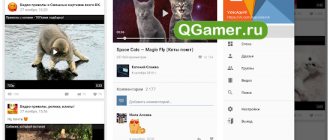
The format works in mobile and desktop versions of the site; entries are shown in the users’ news feed and on the walls of other communities. As with any post, you can add up to ten attachments to a promo post: illustrations, videos, surveys, maps, products, and others.
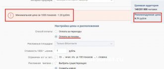
The advertiser pays for advertising in this format using the CPM model. Advanced targeting settings are available for ads, as well as retargeting. These options allow you to either select or exclude audiences that have already seen your ad.
The format supports the installation of counters from third-party traffic audit systems, such as AdRiver and Weborama. To run independent statistics tracking, you must connect a pixel from one of the systems.
Promo posts are suitable for promoting publications with information about the company’s services, competitions and events, and surveys. Using this format, an advertiser can work with users at different levels of the funnel: target new users and increase brand awareness, tell people already familiar with the product about the benefits, carry out up-sells and cross-sells, work with existing customers (advertise limited promotions, provide bonuses etc).
There are two ways to run an ad post:
- Promote an existing entry in the community.
- Create a hidden post without posting on the wall and show it only in the news feed of the desired audience. With the help of hidden promotional posts, it is convenient to attract new users to the community and conduct A/B testing of creatives or targeting.
By default, advertising posts are shown in users' news feeds. However, it is possible to display promotional posts in an advertising network - popular communities that are monetized by placing advertisements on the wall and in the news feed of subscribers. It is important that the target audience is selected based on the targeting settings specified when setting up the ad.
The advertiser can choose in the settings where exactly to display the ad. Connecting a network increases reach and, as a rule, reduces CPM.
You can check the effectiveness of a promotional post using the “Evaluation of advertising posts” metric (appeared in November 2021). The algorithm takes into account positive (following links, watching videos, joining a group) and negative (complaints, hiding from the feed) user interactions with a publication and compares them with competitors’ ads within the same format. The rating begins to be displayed after 2000 impressions of the promotional post.
You should not choose “Score” as the main indicator of campaign effectiveness. The metric is useful for A/B testing and will indicate a post with a low rating in order to control the budget in a timely manner.
A few recommendations for running advertising posts:
- Try different targeting settings: by interests, communities, similar audiences, remarketing audiences, geolocation, etc.
- Test ad design:
- attract attention and engage: add videos, GIF animations, bright colors to your ad, but remember that the quality of the ad should not suffer from this;
- focus on the main thing - important details should immediately catch your eye;
- Create ads that match your audience's interests;
- add high-quality and clear images;
- images can describe the benefits of a product or service, talk about a successful purchase or cooperation experience, demonstrate the most popular product or the arrival of a new collection, collected in one collage.
- Make sure your landing pages are relevant. It is better to place the main information at the top of the landing page, in plain sight.
- Alternate ad formats to promote the same product.
- Analyze statistics and promptly control changes:
- change the bid if the intensity of impressions or the recommended value has changed;
- set limits at the level of ads and advertising campaigns to control budget expenditure;
- examine demographics and their impact on performance;
- If necessary, create a separate creative taking into account the specific demographics of the audience.
Publishing texts and images
This type of content is located on the left side of the screen. You can view it only by logging into your VKontakte profile through a browser on your PC.
Tips for customizing content
- The image must be 148x85 pixels in size.
- The file size should not be more than 5 megabytes.
- Almost all graphic formats are available.
- The maximum header length is 33 characters.
- The description must be no more than 70 characters long.
Text-graphic block: advertisements on VKontakte pages
This format allows you to promote an application, community or external site. Specific ad formats are available for each advertised property. Ads are shown only in the desktop version of the site on the left side of the page.
A text-graphic block can include up to three advertising entries on each VKontakte page. Payment is made per click (CPC) or per impression (CPM). Ads support behavioral and targeted targeting, as well as pixel or CRM retargeting.
The main task of text-graphic block ads is to generate traffic. However, with the help of such advertisements, a company can also increase awareness, attract new users, and announce promotions.
In this format, the main thing is the visual component, not the text. It is the picture that attracts attention, so it is important to choose a catchy illustration that will not lose quality due to its small size. A high-quality image in an ad ensures a high CTR. Creatives must be relevant to the interests of the target audience and evoke emotions.
The text and image ad block can display four formats:
- Image and text. The ad consists of a title (up to 33 characters), a picture measuring 145x85 pixels and a description (up to 70 characters).
To motivate the user to take the target action, you need to include a CTA in the description text, for example, “learn more”, “read on the site”, “buy”. The length of the description line allows you to tell a little more about the offer:- inform customers about promotions and discounts;
describe the competitive advantages of the product;
- indicate the price in order to cut off the audience for whom it may be high.
- Large image. The ad does not have a description, but there is a title (up to 33 characters) and an image measuring 145x165 pixels.
The link can lead to a site, community, or application. The main focus is a large image, thanks to which the ad attracts the user’s attention and encourages them to click on the ad for detailed information about the product or service. You can place catchy and easy-to-read text on the image, for example, the main benefit, selling triggers, brand name or CTA. - Promotion of communities. Includes the following elements: header, 145x145 pixel square image, CTA buttons “Join”, “Follow” for groups and public pages or “I’m going” for events, and information about the number of members or friends in the community.
Such advertisements help increase the number of subscribers in the VKontakte community. An active CTA button allows you to join a group or take part in an event without going to the community page. The format works well for well-known and popular brands. - Square image is a format for promoting applications and games. The ad includes a 145x145 pixel image (or uploaded by the advertiser), the name of the application, the number of friends in the application, and the CTA button “Play” or “Launch”.
- Special format for app promotion. Ads appear on the app catalog page and in the news feed. In addition to the app name and image, you can add its rating and genre. The image can be either the app cover or a manually uploaded 128x128 image.
Special listings do not participate in the general auction. They compete in a separate auction with competing ads of the same format.
The coverage in the feed is much less than in the text and graphic block on the site pages. In-feed ads provide brand presence among news and user posts and increase awareness. On the application catalog page, the design of advertisements does not differ from the list of other games and applications. If the user is shown relevant advertising here, taking into account interests and other targeting, then the probability of receiving clicks and transitions is very high.
The size of images on the
Instagram
The size of the avatar in the profile is 110x110 px. Photo size in posts is 1080x1080 px.
- uploaded photos are presented as square thumbnails on the page, which should also clearly show the content of the post.
- Photo content is displayed with a resolution of 612x612 px.
- In the news feed, the photo is displayed in size 510x510 px.
- The post thumbnail is 161x161 px.
- For rectangular photographs (portraits), it is better to choose a resolution of 1080x1350 px, or keep the ratio 4:5.
Story size – 1080x1920 px.
- Instagram Stories allows you to upload both vertical and horizontal images with aspect ratios from 9:16 to 1.91:1.
- For vertical images in stories, the recommended size is 1080x1920 px.
- The photo size in Stories allows you to share full-length personal photos or large announcements with text.
- The minimum size of a photo or video for Stories is 600x1067 px.
- Proportions 9:16.
- Allowable file weight is 4 GB.
IGTV cover image – 420x654 px.
- It is recommended to use images with an aspect ratio of 1:1.55.
Advertising in the Instagram Feed and the “Interesting” tab
- Square: from 600x600 to 1936x1936 px (aspect ratio – 1:1).
- Landscape orientation: from 600x315 to 1,936x1,936 px (aspect ratio – 1.91:1).
- Vertical format: from 600x750 to 1,936x1,936 px (aspect ratio – 4:5).
- When creating an ad, you can crop the image in the built-in editor.
Photo carousels in the VK article editor
The innovation will allow you to add entire albums to your articles in an easy-to-view format - a carousel. You can upload no more than 30 pictures to one carousel. The article editor has been updated: now creating photo carousels is available to everyone.
To add a photo carousel, you must first add any image to your article. After that, when you hover over it, the “Create carousel” button will appear. Click on it.
It will open windows for creating a carousel of photos, where you just need to add the pictures that you want to show to readers.
Classmates
Avatar dimensions:
- The thumbnail size is at least 190x190 px.
- Optimal size – 288x288px
- The maximum file resolution is 1680x1680 px.
- The Odnoklassniki profile photo has a square shape.
Cover size in Odnoklassniki is 1944x600 px.
- “Safe zone” to save the contents of the cover on different devices – 980x240 px from the middle of the image.
- By pinning the cover to an album, users will be able to comment on it.
The size of the post image in Odnoklassniki is 780x585 px.
- Maximum resolution – 1680x1680 px.
- Cover for the mobile version (it can be downloaded separately) – at least 1024x768 px.
- Aspect ratio – 4:3
- In the news feed, the post is displayed with a size of 548x411 px.
- When expanded, the dimensions of the images are 780x585 px.
- You can upload square, vertical and horizontal images. The sides of the picture are scaled to the limit values.
Advertising:
Advertising formats for promoting pages and groups in Odnoklassniki (source: OK-Mediakit-2019)
- teaser – no less than 90x75px and no more than 60Kb. Located in the right and left columns in the full version of the site;
- banner – 240x400px, no more than 60Kb. Displayed on the right side of the site on a PC;
- multi-format – several images of at least 256x256, 1080x607, 600x600px;
- carousel – from 3 to 6 cards measuring 600x600px.
Advertising formats for promoting games on Odnoklassniki (source: OK-Mediakit-2019)
- game promotion: 128x128 px banner in the “Games for you” section
- The file size for an advertisement is no more than 150 KB.
Image formats: GIF, JPG and PNG.
What benefits in relation to the side banner:
- works both in the mobile version and in the desktop version (teasers only work when you are on a computer)
- Scrolling through the feed, users perceive such posts as native content, and not as advertising, and accordingly pay more attention to them
- promotional posts can be used for different purposes: both to attract subscribers to your public page and to attract traffic to the site
- this format provides more opportunities for experimentation: you can use audio, video, surveys, etc.
Naturally, there were some pitfalls:
Firstly, there are very complex statistics and outcome metrics.
When the format first appeared, post statistics were given with a strong error. Now Vkontakte has managed to regulate the situation a little, but the system is still far from perfect. For the most accurate analysis, we recommend using the cost indicators for target actions in Yandex-Metrica.
For those who create similar campaigns with the aim of attracting new subscribers, the situation is even more complicated: the internal statistics of the post take into account only a part of the subscribers and, if advertising is also carried out from other sources, statistics on growth have to be calculated manually.
Approximate formula: daily growth - (organic growth + growth from other sources) = growth from post.
Secondly, you cannot create many posts at once in order to test different audience segments.
VK moderation will most likely not like the abundance of advertising content.
In addition, as mentioned above, the audience and the cost of the target action from each campaign can only be calculated by testing the sources one by one. This can be a big problem if we need a lot of traffic in a short time - for example, to attract people to an event, etc.
If the goal is to attract subscribers, there is still a way to make it easier. The “Group Audience Comparison” application will help with this.
The point is to upload targeting into the promotional post immediately for all the publics in which we advertise, having previously measured the overlap of the target public and those that we uploaded to the target.
Then you will need to repeat the procedure daily. The dynamics of traffic will be our growth from this public per day. And you can record this, for example, in Excel or GoogleDoc.
Of course, this method is not accurate - its error will be about 20-30%, but it is much more effective than testing each public page in turn.
However, both in the success of the creative and the advertising campaign as a whole, much depends on the actions of the arbitrator himself.
When creating visual content, keep in mind that Facebook pictures display differently in your Timeline and in your friends' News Feed.
Facebook
business page The size of a business profile photo is 180x180 px.
- The photo has a round shape.
- On a computer, the photo is displayed in 170x170 format, on a smartphone - 128x128, on a push-button phone - 36x36, thumbnail - 32x32 px.
- Long brand logos are also cut into a square shape.
Page cover size – 820x312 px.
- The cover image is only shown on the profile page.
- Minimum cover size – 400x150 px,
- The cover photo is displayed in 820x312 px format on a desktop and 640x360 on a smartphone.
- Small images are stretched and lose quality.
Image formats: sRGB and JPG less than 100 kilobytes in size.
- For a better display of your profile photo and cover photo with your logo or text, use a .PNG file.
- Additionally, brands have the option to set an animated cover image for their page.
The image size for the post is at least 1200x630 px.
- In the news feed, the illustration is scaled to a width of 470 px.
- On the profile page it is scaled to a width of 504 px.
The size of the image with the link is 1200x628 px.
- Square-shaped pictures are shown with a resolution of 154x154 px in the feed and 116x116 px in the profile.
- Rectangular pictures are shown with a resolution of 470x246 px in the feed and 428x252 px in the profile.
Highlighted profile image – 1200x717 px.
- In Timeline it is displayed with a resolution of 843x504 px.
- We recommend using higher resolution images while maintaining scale.
Event cover sizes are 1920x1080 px.
- The cover is displayed with a resolution of 470x174 px.
Image sizes for all Facebook placements:
- news feed – at least 254x133px;
- stories – at least 500x889px. Ideal – 1080?1920px;
- Audience Network: native, banner and interstitial advertising – at least 254?133px;
- instant articles – no less than 254x133px;
- Marketplace – no less than 254x133px;
- stories in Messenger – at least 500x889px;
- ring gallery – 1080x1080px.
See also “Aspect Ratio Best Practices” in the Facebook Business Help Center.
Examples of VK carousel design
Finally, here are a few examples of the effective use of such a system.
- An assortment of gadgets from a well-known manufacturer;
- Sneaker Sale;
- Composition of event speakers;
- A small instructive comic.
Where to drive traffic from a promotional post and what to do with it next
To create an effective advertising post, you need to understand exactly where it should lead the user and what target action it calls for.
A target action is an action that a visitor must perform to achieve the result we want.
You can take your target audience to a website, landing page or to a group on VKontakte. As a rule, an exchange of contact information for something valuable (lead magnet) is considered a targeted action on a website or landing page. In the VKontakte group, a person’s target action can be subscribing to the newsletter. For me, working with a group is more interesting. I believe that in this case the efficiency is higher.
Promo post takes you to the VKontakte group
People don't come to social networks to buy things. They come to be entertained and consume light content. You can make a great ad that gets right to their pain point, and people will happily click on the promotional post. But if advertising starts to take them outside the social network, not everyone will be ready to move on and open an unfamiliar site in the browser. In this case, part of the traffic will be lost. Especially mobile traffic, which now accounts for almost 80% of all VKontakte traffic.
In addition, clients often ask to bring people to a site or landing page that is simply “incomplete” and does not meet basic requirements. A targetologist can bring super-targeted traffic to the site. But if the site is not ready, not tested, traffic will not save the situation.
Therefore, I prefer not to bring people into the outside world, but to give them the opportunity to remain within the familiar and comfortable boundaries of the social network. I send traffic to the VK group, and install a mailer application there. This is an analogue of email newsletters, only within VKontakte. The main goals of mailings are to warm up the audience and prepare for sales. The main advantage of this service is that VK users receive your messages on behalf of your group directly into their personal messages. The opening rate of such messages is many times higher than that of emails.
In addition to the newsletter, you can attach other applications to the VKontakte group. For example, the Questionnaires application. “Questionnaires” are an additional lead form in which you can collect contacts and necessary information if you are registering, for example, an event. An even more universal analogue is the “Application Collection Form”. Due to the fact that you can add design elements to the header, the “Application Collection Form” looks like a mini-landing page.
The Tests application is also often used to warm up the target audience. Here you can ask a question about your topic and offer users answer options.
I also regularly use a tool called surveys. It’s interesting that people on VKontakte are more willing to participate in surveys than to like them. A survey is a great opportunity to generate potential leads. For example, I recently launched a survey: “Do you want to get a consultation from a cosmetologist on service XXXX?” The answer options were: a) yes, I want; b) need to think; c) no; d) consultation is needed, but on a different issue. Of the 139 people who voted, 77 people chose “yes, I want.” Then the account administrator contacted them and clarified what exactly they wanted to receive.
When conducting surveys, a prompt response and a competent sales script are important. The client can be caught even in the comments.

