No one will deny the fact that when choosing a video on YouTube, the user first looks at its preview, and only then at the title itself. It is this cover that serves as an enticing element, and that is why it is important to know how to put a picture on a YouTube video if you intend to seriously start working on it.
What is a preview
Previews are images that, like book covers, viewers see before starting the video.
Videos on the channel, designed in the same style:
Most people look at the cover before even reading the title of the video, so a good picture will attract the attention of more viewers.
The cover must meet a number of criteria: be bright and loud, perhaps even shocking. Have readable text, match the theme and style of the channel, and not violate the requirements of the service.
Design your entire channel in the same style
For each cover, use a similar composition, color palette, and fonts. Firstly, it is simply aesthetic, and secondly, the viewer instinctively perceives it as something already familiar. This means that they are highly likely to click on your next video.
For inspiration on designing channels in a single style, refer to Western channels about creating videos Think Media TV or Prime Video. And, of course, don’t forget about our channel VideoHare.rf .
IMPORTANT:
- When constructing a miniature composition, it is useful to use the “rule of thirds”, based on the principle of the golden ratio.
- The optimal combination is to place the hero’s face or object on the right, and the title text to the left, but this is not an axiom. Only tests will help you understand what works best in your niche.
How to put a preview on a video
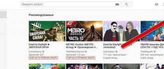
By default, YouTube asks you to choose one of three random frames from your video to use as your cover photo. This method has significant disadvantages:
- Random shots are rarely successful.
- They don't brighten the picture or use text or visual effects.
However, there is a way to gain more control over your thumbnails.
Only users with a verified account can upload images. To verify your account, you must go to www.youtube.com/verify and indicate your country and phone number. Within a few seconds you will receive an SMS with a code that you must enter to confirm the number.
To change the cover image of a YouTube video, go to Creator Studio and select Video Manager from the menu on the left.
Select a video from the list and click “Edit”.
On this page you select a frame or add your own icon.
The picture is installed.
How to set your own picture
To put a cover from your own picture, at the sixth stage of the previous list, instead of selecting the proposed frames, click the “Upload your own” button. A Windows Explorer window will open, asking you to specify the location of the image on your computer. After downloading it, you will be able to select your picture as the background of the video.
Important! You can set your own cover only when the video is uploaded. During further editing, you will only be able to select images from those downloaded earlier or those suggested by the system.
YouTube preview size
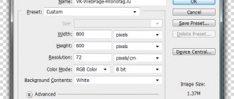
The recommended cover size for YouTube is 1280 x 720 pixels. Previews can be larger or smaller than the recommended size, as long as the aspect ratio is 16:9 and the minimum width is 640.
Follow the recommended YouTube preview sizes so that the image does not lose quality when reduced. Check in advance how the picture will look in a reduced size. Make sure all elements are easy to read.
Note! YouTube channel covers 2560 x 1440 and 2048 x 1152 are not the correct preview sizes for YouTube. These are the dimensions of the channel header banner.
YouTube preview pictures
As a picture for a video on a gaming channel, you can take a screenshot from a computer game, or use ready-made pictures.
Cover images can be downloaded from our website. They are in thematic sections: minecraft, anime, boys, girls.
You can create an image either from scratch or using ready-made templates. On the Internet you can find a ready-made preview template for YouTube in PSD and edit it in Photoshop, replacing the background and text with your own. The easiest option is to use online editors.
Tips for creating and choosing a cover
To avoid making a mistake when choosing a cover, take into account the recommendations of SMM specialists.
- The cover should arouse interest and a desire to watch the video. Choose a photo that does not stand out from the general style of the page. You can add a call and corporate logo to the preview.
- The screensaver should display the content of the video. The ideal solution is to add a title in easy-to-read text.
- Remember the compositional rule of thirds. To improve the expressiveness of the frame, the object in the photo should be located at the intersection points of imaginary horizontal and vertical lines (you can use a special grid in a DSLR camera or in Adobe Photoshop).
Cover photo on YouTube
People, inspired by popular video bloggers, upload home photos to hosting. Personal photos make the channel individual.
Example of photos on rollers:
You can use photos if they correspond to the content of the video. In addition, photographs must be of high quality and meaningful. You should not use selfies taken with the front camera of your phone.
You can use photos downloaded from the Internet if they are freely available and do not violate copyright.
Methods for creating a screensaver
There are three main methods by which you can create a preview on Instagram. An elementary and easy option for maintaining a harmonious style of the news feed is a smartphone gallery. This method is suitable for those who do not want to fool themselves and those who do not have free time. When posting a post, select the “Publish multiple pictures” function on the social network. Place the photo you like as the first file, and the video as the second.
This way, the feed will maintain a consistent style. And your subscribers will be able to view the content by simply scrolling through the image.
The second option is intended for files with an abundance of aesthetic moments. After selecting the material for the post, at the bottom of the “photo hosting”, click on the “Cover” line. Scroll through the video using the cropping method, choosing the most beautiful frame. Having published the material, when viewing their feed, your audience will see a post with this selected frame.
Also, today there are many tools for creating screensavers. The Inshot application will help solve the problem of how to make a cover for a video on Instagram.
Subscribe to our Telegram channel, there is a lot of useful information and live discussion - https://t.me/proinstagramer
Preview font
You can download a million fonts on the Internet with your own style and features. But not every font is suitable for the cover of a video or the header of a YouTube channel.
If you look at the bulk of covers, you will notice that most use bold sans serif fonts: Impact, Gotham Black, Helvetica Condensed Black and the like. Serif fonts such as Times New Roman should be avoided. Another category that doesn't fit is decorative fonts.
When choosing a font, pay attention to its readability against the background for the cover of a YouTube video. Don't choose a font that is too light and will be barely visible against the background. The text should be a color that contrasts with everything else. Please note that the preview will be reduced, so the text should occupy at least 1/3 of the image.
You should not place a large amount of text so that it does not crowd out the rest of the image elements. You can adjust the letter spacing in Photoshop to fit more text into the image.
What is a YouTube video icon and why is it needed?
When uploading a video to the channel, the platform offers to select a cover for your publication from the saved video. But it’s better to make pictures for the videos separately. And that's why:
- The ability to maintain the general style of the channel . If you always create your own video cover, then all previews will be made in the same style. This will make your channel more attractive.
- Using high quality images . YouTube often offers users not the best images; they are blurry, and such icons do not always convey the essence of what is being said in the video.
- Ability to apply multiple backgrounds to the preview . In order for the cover to be viewed better, it is necessary to make two backgrounds: the background can be darkened and the user can focus attention on the foreground. When choosing automatic images, this cannot be achieved.
- Using captions . If you want users to understand what the video is about when viewing the preview, then in the graphic editor you can write keywords in the picture, which will increase the number of views.
This is interesting: How to customize a YouTube channel logo
How to make a preview online
If you don’t know how to work in Photoshop or it’s not installed on your computer, you can create a cover for YouTube online using the free service Canva.com.
Create an account on this site and scroll down the main page to the “social networks and email headers” section. Select "YouTube Thumbnail". In the editor that opens, a number of ready-made layouts will appear to choose from, in which you can easily change the background and text, and then save the result to your computer.
You can find backgrounds for YouTube on the Internet by request that matches the theme of the channel.
In this article we will talk about promotion on YouTube. If you follow me, then you know that I have already talked more than once about how to promote a YouTube channel, but today we will talk about one of the key, I would even say the most important thing that will help you promote and retain your audience.
Before reading this article, be sure to watch my video on this topic:
However, let's start a little from far away. In fact, the development of your YouTube channel is largely influenced by only two important factors:
- The cover image of your video, also called a preview
- Keeping the viewer on your YouTube video
Today we will look at the first factor. I will tell you what 7 points influence people to actually click on your YouTube video cover and why it is so important to follow these small rules.
I am sure that after you read this article, you will be able to make or order the perfect cover for your video. And that’s all, because further, in the second part of this article, I will show you our tests, with the help of which we found out which YouTube video screensavers we received the most clicks!
The very first thing that affects your preview is the presence of a face, your face, or the person you are talking about.
This is understandable, a person on a subconscious level trusts you more - after all, you showed the owl your face - you, firstly, are open to him, and secondly, he immediately understands who will be the presenter, or the main topic of this video.
Don’t forget that the face should be a close-up. We have repeatedly tested YouTube video covers that show just a face and a close-up of the face. A close-up face always wins; such previews are clicked on much more often.
Second, there should be emotions on the face. This is not necessarily a plastic American smile - it can also be negative emotions. Sometimes they work even better than positive ones.
The most important thing is that they exist and reflect the mood of your video. They can even be somewhat intriguing if, for example, it is an expression of extreme surprise or indignation.
In fact, this will work very well, because in combination with the first point, your face will carry a lot of information (about the presenter, that is, you, about your attitude to information, etc.), which is really important in order make the cover of your YouTube video high-quality. In fact, it is very important that your YouTube video intro is informative, because it is important for people to know what you are talking about in order to understand whether your video is interesting to them.
The third point is that the picture for your video should be bright.
You know, there is a filter on Instagram where you can make an ordinary dim photo unrealistically bright. And basically after this the photo becomes much more interesting and attracts much more attention.
The same principle works on YouTube. Try to saturate your preview with color and light as much as possible, and you will notice the difference in how much more people will click on this particular cover.
The whole point is that the eyes of a sophisticated viewer who is flipping through the feed will not be drawn to the cover, which is uninteresting in terms of color, so he will simply skip it. And no, now we are not talking about dark or gray tones. There are such dark covers of YouTube videos that you just want to click on them. Often such screensavers are used for some kind of mystical videos. And at the moment I'm talking about color saturation and depth. This is really important.
If you are far from all this, then just try to imagine any of your bright T-shirts from childhood. Remember how beautiful she was. Now remember her in a few years. She was all faded and looked just terrible. This is the depth and saturation of color. Over time, the T-shirt lost color - it became less and less saturated, and therefore less attractive. Draw your own conclusions.
The next thing that works well in video covers. On the one hand, this is a close-up of a face, on the other hand, there is text that tells what the video will be about.
The text should not be boring. It should be as emotional as possible, so that a person would madly want to click and find out the answer to the question he asked his head: “What’s there?” You can look at examples of writing such texts in the yellow press. They write headlines in such a way that you really want to read this article to the end. The same thing works here.
In fact, it’s a whole art to come up with slogans, short speeches, and very succinct names. Copywriters who are engaged in this type of activity are highly valued, since there are not many specialists who could come up with such a slogan or a name that would make you want to know more about a product, article or video. It's really difficult.
If you don’t have the opportunity to always order the services of such a specialist, then just think about what your video is about. First, try to describe it in several paragraphs, then reduce it to one. Leave 3-5 sentences. Now, re-read and try to generalize. Make one sentence that brings everything together. For example, this article could be described something like this: “I talk about the best ways to create previews.” Now reduce everything to one phrase.
Repeat this several times. Find the most successful phrases. Put yourself in the place of the viewer - would you be interested in finding out what this phrase hides behind it? Would you click on the preview of such a video?
This is how you can practice making interesting titles and texts. However, this is a completely different story.
And few people talk about the next point, but I learned about it at American conferences.
So, when you put someone's face in close-up, it is important that the person is looking at the camera, at the viewer.
If you look to the side, then you are closing yourself off from the viewer. Here you can draw an analogy with real life. If you hide your eyes from a person, then on a subconscious level he believes that you are hiding something from him, hiding something, and not trusting him. This makes him much less willing to continue communicating with you. The same thing works with YouTube video screensavers.
And the last, seventh point.
Turning your head is very important. If there is text to the right of you, and you turn your back and look away from it, then people will not click on such a picture. At the same time, if you turn your head towards the text and at the same time look at the viewer, then this will be the best head position you can have.
Why is that? There are two answers to this - the first is the rules of composition. This is more for designers and artists. Such previews will simply look more harmonious.
Well, the second is again our favorite psychology.
It is important to remember that people often scan the feed very quickly. And when he sees the preview, the first thing that catches his eye, of course, is the central figure, in our case the face. Our user will follow his gaze, he will secondarily look at the place where the portrait is looking. And if it is some empty corner or, in the worst case, the edge of the screen, then the person will simply scroll through your YouTube video cover further, he will not be interested in it.
But if the gaze is directed at the text, then the person will read it, understand that he wants to know what is hidden under this catchy phrase and watch the video.
Well, now I want to show you the backside of our channel. I want to show what previews we tested and what results we got.
7 promotion tips on Instagram
I want to start with one of the strongest examples, thanks to which we increased the CTR (click-through rate) from 4.85% to 6.85%. Why did she get up?
We made another picture, only we made the same face large. You see how important it is to have a close-up of the face. And due to this, we immediately increased the CTR of this image by 2 percent. Go ahead!
The scary truth about Instagram stories.
We just decided to redesign - What if the lettering was in the middle instead of on the left?
Despite the fact that the face is smaller, the CTR turned out to be slightly higher: 6.23% instead of 5.93%
Five mistakes of smm or don’t kill your social networks
That's how important the title is! Well, again, there are slightly different emotions here - the first option is better.
But why am I showing you all this? And to the fact that you need to test. Constantly change pictures, look at the CTR. Well, we move on!
New items in promotion and promotion
4.36% was original. I think: “Well, that’s it, now we’ll make a close-up of the face, we’ll make a bright face, we’ll make an Instagram icon, and new items. We will remove all unnecessary inscriptions and all distracting objects.” And what have we achieved? CTR increased by only 0.11 percent. Not a lot, but ok, they enlarged them anyway, and the second one just looks cool to me.
11 ways to promote on Instagram
Here we increased the CTR due to the fact that the face was made close-up and the inscription was made large. And increased CTR by almost 1%.
How to get subscribers
We filmed a hype video because there was such a request. And so, the initial CTR showed 5.92 percent. Then we decided to change the picture and call it “Free Subscribers,” and made the face a close-up. They raised it slightly by 0.42 percent.
How to get your first thousand subscribers for free
Actually, we just decided to play with different names. You see, there are not much changes, that is, they are present, but still just a little.
First thousand subscribers in a week
There is also this example where I actually asked the designer to do the same thing, but with a different background. I'm tired of the trash on the channel. 5.47% was the original, 4.21% deteriorated CTR, but the condition is actually not the same.
I asked to make the same picture, but just on a purple background. But it turned out that the first one has a larger face and fewer inscriptions. These things can influence statistics. An objective test will be if the picture is exactly the same as the first one, but the background is purple.
And the last example that I want to show you is one of the videos that has received a lot of views over the entire time, in my opinion, something more than 450 thousand. Well, we thought, why not try experimenting with CTR.
They gave it to another designer altogether. Completely, you see a different format, that’s it. And in the end, not much changed, just a few fractions. That's it.
Did you like our split tests? Be sure to write about it in the comments.
I also want to invite you to a master class, where I talk about how difficult it is to promote on social networks and how you can become an SMM specialist and earn from $1000 monthly working remotely. Click on the link in the description under this article and register!
