The new VKontakte menu appeared at the end of May. There were a lot of complaints back then: the functionality was limited, and it was impossible to remove the menu from the group, and widgets had to be hidden because of this. We even wrote an article about this.
But now the developers have fixed everything. Now you can hide applications and widgets, or remove the menu altogether.
But for some reason in many communities it’s still like this:
One of the reasons is a lack of understanding of how to use this tool, what to put there, where to lead the client. Before copying menus from other communities, we advise you to think many times whether this will make sense. And at the same time look at the menu of groups with a similar target audience.
Construction topics
What is important:
– show options for apartments and houses, their advantages;
– inspire confidence in the developer and company.
Here is an example of a construction menu design. Using it you can view not only apartment options, but also individual residential complexes.
When you click on the “Choose an apartment” icon, you will be taken to the Marquiz quiz constructor.
You collect a customer base, and visitors to your group enjoy the convenience of choice.
The “Select Apartment” window leads to the group’s decorated products, where you can immediately see the layouts.
Another example of menu design for a construction company:
Click on “Reviews” and go to the “Video” section. This is a great way to build trust in the company, since we can look at customer reviews rather than read them.
A company manufacturing metal structures (fences, gates, stairs) also chose the Marquiz quiz constructor to calculate the cost of the structure.
And for easy navigation through the group, the company uses hashtags. Click on “Portfolio” and you will be taken to a page with all posts in this category.
Interesting design from the construction site.
If you would like to read useful articles about repairs, please do so.
Would you like a test?
What can I say, the guys tried their best.
How to make a menu in a VKontakte group?
A few years ago, when we were young and green newcomers to SMM, finding a suitable guide for layout of the VKontakte group menu was not a very simple task. Time passed, there were more and more supposedly open step-by-step instructions, beautiful groups too, but there was still no quality guide “from start to finish.” Or it’s hidden so deep in the depths of the Internet that you can’t easily find it with just a few searches.
We conducted an experiment. They took a fairly smart SMM manager (1 pc.), an empty VKontakte group (1 pc.) and offered him, relying on Google, to create a graphical menu layout. It took about 3 hours of working time, 7 (!) thematic articles from the top, 3 mugs of coffee and about 15 angry exclamations of varying degrees of obscenity.
This is because some articles examined the issue superficially, some, on the contrary, led into the wilds, and some (seemingly not bad in appearance) omitted one or two details, without which the entire harmonious system would collapse.
And here we need to take into account that our manager is a tougher nut to crack than Bruce Willis, who has already dealt with wiki markup (just not very often) and had a rough idea of how to make a menu in a group. What can we say about those for whom the VKontakte menu is completely terra incognita? We decided: stop putting up with this! It's time to figure it out together!
Bruce agrees and is also determined
Step 1
How to make a VKontakte menu? Defining the structure
Wondering how to make a beautiful menu for a VKontakte group (or, at worst, at least a nice one)? From the very beginning you need to decide two things:
a) what do you want to show people – specific products? reviews about you? portfolio and price?
b) where will this information be located - on your website or in group discussions?
Crib
What items should be included?
If your group is about services:
- portfolio,
- reviews,
- Services,
- contacts,
- team.
If your group is about products:
- range,
- reviews,
- How to order,
- Payment and delivery.
These are the key points. If desired, they can be replaced or supplemented, but now you have the main directions.
Determine what you first want to talk about, and then start designing it.
Step #2
Menu for VKontakte group – picture
When you decide on the menu structure, you need to get two pictures. Usually designers have them in large quantities, but if you love and know how, you can create them yourself in Photoshop.
The first picture will serve as the “cover” of the menu, the second – directly for navigation.
Standard view of a menu in a group (before it is clicked)
Open menu with buttons
Check that your picture with “buttons” fits into the standard menu sizes in the VKontakte group - width 600 - 606 px , height - at your discretion.
Did you get the pictures? Great! We put the first one (which will be the cover) aside, the second one (with the buttons) we put under the knife. Literally.
We won’t describe the process in detail - it’s better to see it once.
All! Menu images are ready.
Step #3
How to make a VKontakte menu? Community preparation
Before making a VKontakte wiki menu, prepare a group: through the “Community Management” button, connect the “Discussions” and “Materials” sections. In this case, materials must be limited.
This is what the setup “path” looks like in the screenshots
Click #1
Click #2
Click #3
After this, your community page looks like this - the ability to add discussions has opened and the “Latest News” section has appeared.
This is what we needed.
Step #4
How to make a VKontakte group menu? Preparation of landing pages
Remember step #1? There we decided where we would lead people - to the site or to the discussion section.
- If your option is to go to the website, then feel free to skip this step.
- If there are discussions, you will need to prepare them in advance.
Our goal is to have one discussion page for each button.
Click the “Add discussion” button and enter a title and text. And so on several times until the content for all buttons is ready.
Step #5
How to add a menu to a VKontakte group? Programming
And now comes the moment of truth: the actual creation of the menu. Go to the “Latest News” tab and start editing.
Once
Upload previously cut menu fragments through the “Add photo” form. Important: the fragments must go in the sequence in which they will later be assembled in the final picture. We get the following:
It doesn’t look much like a real VKontakte wiki menu yet, does it? There are sudden gaps between the fragments of the picture, and the picture itself is very small. Just a minute of patience, everything will be fine now!
Two
Go to “Wiki markup mode” (in the previous figure, the transition button is highlighted with a red frame). And we see this.
This, however, looks even more intimidating and certainly does not look like a beautiful menu that will help promote a VKontakte page or brand group. Whatever, in this form it won’t even make this group at least attractive.
Therefore, feel free to edit the source code!
Three
First , remove empty lines between lines of code.
Second , we correct the image dimensions: we check the length and width of each fragment of the image and write down the actual numbers, and not what VKontakte inserted into the code by default.
Third , add a piece of code ; noborder ; nopadding , which will remove spaces between image fragments.
Fourth , we insert links either to previously created topics (see step #4) in the format topic - xxxx _ xxxx , or to the necessary pages of the site in the format https:// xxxxxxx / .
The result should be code like this:
[[photo19868051_456239284|600x92px;noborder;nopadding|topic-147443169_36917026]] [[photo19868051_456239285|600x85px;noborder;nopadding|topic-147443169_36917026]] [[ photo19868051_456239286|600x83px;noborder;nopadding|topic-147443169_36917026]] [[photo19868051_456239287|600x81px ;noborder;nopadding|topic-147443169_36917026]] [[photo19868051_456239288|600x87px;noborder;nopadding|topic-147443169_36917026]]
Four
Change the line “Latest news” to the word “Menu” and click “Save page”.
Five
Save the link to the menu (it's in the address bar).
Step #6
How to make a menu in a VKontakte group? The final touch
We return to the main page of the group and create an entry:
- paste the copied link,
- wait for the menu to load,
- delete the link,
- load the previously deferred second image for the “cover” of the menu,
- We are publishing a post on behalf of the community .
After the post is published, we pin it.
Now you know how to make a VKontakte menu for a group, and you can create and design any community. So be bold - create, try, enjoy the results.
PS. If you don’t have time to study how to make a menu in a VKontakte group, or if you don’t have a good designer at hand to create pictures, contact us - we’ll be happy to help!
Beautiful groups to all!
Catering (cafes, restaurants)
What is important:
– show the atmosphere of the establishment;
– talk about the menu;
– announce promotions and discounts;
– share the mood and feedback of visitors.
The SUN Project chain of restaurants and cafes offers not only a wide range of drinks and dishes, but also show programs.
The menu is bright and sunny. It combines two formats at once: the old and new menu.
Click on “Menu” and select a restaurant:
And here we have all the necessary information:
SUN Project also motivates you to leave feedback in the form of a “Questionnaire”:
A network of city cafes called “Samurai” immediately attracts attention with its bright red color:
The “Samurai” menu is located in the album:
Cafe Rosemary took a different approach. They decided to abandon covers with icons. The focus was on live, juicy photos.
Click on “Wine Map” and the pdf file opens in the browser. We're not sure if it's convenient from a phone, but from a computer it's more than convenient.
Beauty salons, hairdressers
What is important:
– demonstrate the range of services;
– show the quality of service;
– give the opportunity to register online;
– show the atmosphere of the salon.
The menu of the Versace beauty salon looks simple and neat.
An interesting detail: you can see the interior of the cabin. After all, many people visit such establishments not only because of the quality of services. Going to a beauty salon is also an increase in your self-esteem.
Men's barbershop Cutlers uses darkened live photos for its menu.
Registration to the master is carried out through the YCLIENTS application:
The hair salon chain Haircut by Haircut uses icons on a bright orange background with a gradient.
The “Examples of Work” icon leads to community albums, where all services are collected by category:
The men's hairdressing salon "USA" made large inscriptions with images:
They gather their audience using the Senler mailing service:
Bottom line
We looked at what a wiki menu is in VKontakte communities. We learned how to create it and use various commands.
We believe that the menu has not yet been fully appreciated. For a lot of people, this “wiki markup” is something super complex and scary. They don't even want to take it on. But in reality, as we see, everything is quite simple.
Don't be afraid to experiment and be original!
Rate the text:
[Total: 3 Average: 5/5]
Author of the publication
offline 7 years
softmarker
Comments: 95Publications: 268Registration: 05/15/2014
Car services, car washes
What is important:
– show the range of services;
– convince the client of the quality of the service.
The SPBGARAZH car service also uses icons:
An interesting “trick”: when you click on “Ask a question” we immediately get into a dialogue:
Autotech chooses a muted red color with large icons:
“Trick”: in the menu there is a “Parts Finder” (that’s the name of the application itself):
The application allows you to place a request for the necessary spare parts, view stores with them or see disassembled cars.
The MasloMarket auto store made the icons themed:
You can sign up for a CTO through the YCLIENTS application:
And in this group we see a division into categories of spare parts. We immediately select what interests us and find out all the information.
Creative studios
What is important:
– show a variety of activities;
– remove objections (“it won’t work”, “I have no experience”, etc.);
– demonstrate the atmosphere in the studio.
Pottery studio No. 1 from St. Petersburg uses the same background for menu covers and places icons on top.
When you click on “Master Classes” we get to the products:
Studio "Kolibri" uses only live photos:
The “You are with us” tab is a transition to the group’s albums with all types of classes and studio master classes.
The creativity studio “Made with Soul” offers to sign up for free master classes right in the menu:
To do this, he uses a special service for children:
Decoration, design, decoration services
What is important:
– show beauty, aesthetics, taste, an unusual view of things;
– demonstrate the assortment;
– make ordering online convenient.
The Ga-den company produces interior maps of the world and countries. Hence this menu:
When you click on the “About Us” icon, a longread opens (VKontakte article), where the company introduces its team:
DECORANTOS specializes in wedding decorations. The menu is designed in soft pastel colors:
A young couple who is looking for a wedding decor studio can immediately fill out an application for wedding decoration in a group. Very comfortably.
PR advertising is a client of our agency. Engaged in outdoor advertising placement in Ivanovo.
We just recently designed this menu. We decided to divide all the content into categories using navigation hashtags.
By clicking on a category, the reader can read its latest news:
The convenience of this navigation is that all posts are automatically placed into categories. There is no need to update the menu category every time to keep the information in it up to date.
Marketing communities, online agencies
What is important:
– show that you are coolly packaged and are ready to offer yours;
– demonstrate your expertise (with the help of cases, useful articles).
TargetHunter, a service for analyzing and automating the search for target audiences for targeted advertising on VKontakte, uses a noble dark blue color:
The “Support” section leads to another community where users can ask questions on the topic and get feedback. Thus, the service collects its target audience.
More recently, Spark also appeared with icons that lead to their Instagram and Telegram.
In our VKontakte group, we share useful materials for developers, online stores, B2B companies, and owners who provide services to the public.
The materials were divided into categories and placed on the menu. This way, the target audience immediately sees that this group can be useful to them.
When you click on the desired section, you will be taken to a longread (VKontakte article), where you can see various
Preparatory work
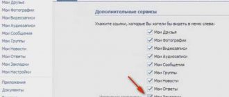
Before you create links to group sections, you must activate them. Otherwise, the community will not have tabs with photos, audio recordings, discussions, documents, and other things.
Instructions for activating partitions:
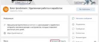
- Go to the list of Groups. Then switch to the “Management” tab and select a community in which the user has administrator rights.
- Under the group avatar, click on the “Manage” link.
- In the block on the right, click on the “Sections” line.
- Next to each section, click on the “Disabled” inscription and select the access mode: limited or open. In the first case, only the administrator or editor will be able to add materials, in the second - any group member.
When sections are activated, you should open each in a separate tab and copy the links from the address bar into a text document. They will come in handy when creating a menu. At this point the preparation is completed, you can begin the actual work.