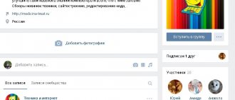
In December 2021, VKontakte introduced new functionality that helped revitalize company communities - live covers.
The community owner can upload up to five images or short videos, which change automatically. Such a cover is guaranteed to make the design of the group in VK more memorable, help tell your story, and show the main products and services.
Automatic promotion on Instagram without blocks
We recommend : Jesica – an application for promotion on Instagram (from the creators of Instaplus.me). Install Jesica on your Android phone or computer and the app will like, follow and unfollow as if you were doing it yourself:
- No blocks. Limits apply as if you were doing it all manually.
- Safely. You do not need to enter a password for your account.
- High speed. You can give up to 1000 likes and 500 follows per day.
Try 5 days free >> Advertising
Dimensions Live covers for the VKontakte community
At the beginning of 2021, Live covers became available to all community owners, but VK itself very briefly described the requirements for videos and images for live covers.
The recommended size for a live cover is 1080 x 1920 pixels. (width 1080 pixel, height 1920 pixel), we recommend using the mov container, h.264 video codec format, optional frame rate 25 (Pal) or 30 (NTSC) and that's all.
Targbox was the first on the network to understand all the subtleties and nuances when preparing videos and images for Live Wallpaper. In this article you will learn about the sizes of live covers and how to install them.
First of all, we must understand that Live Covers are only available in the VKontakte mobile application for IOS and Android.
There are 3 loading options available.
- Upload up to 5 videos that will change automatically.
- Upload up to 5 images that will be automatically replaced
- Upload up to 5 images that will automatically change, but each image will be enlarged. (By default, this function is turned on; to cancel enlarging images, uncheck the item Show photos in motion .
The sizes of the first and second options do not differ and require the same preparation/
What is a dynamic cover
This is a graphic design option for the VKontakte community. An image displayed at the top of a group window containing dynamic elements.
Example of a live cover
Pay attention to the picture above. Subscriber pages are displayed here. These blocks are automatically updated - when a new member joins the group, his page automatically begins to appear on the cover, in the “New Subscribers” block.
Below are the most commonly used blocks.
- User ratings
. The most active, newly joined, last commented. - Actual information
. Date, time, various courses, timers. - Data from third party sites
. If you have a resource on the network and certain programming skills, you can display the necessary data on the cover.
Uploading videos or photos without the “show photos in motion” feature.
Let's define 2 cover visibility states:
- For convenience, let’s call this shortened version of the live cover a preview—the part of our cover that users see when they go to the community page.
- Full / expanded view of the live cover - after clicking on the preview, users are shown the full cover.
Abridged view of the live cover
Full view of the live cover
An absolutely logical question is how to place the basic information so that it is visible on the preview and in the full version. Let's figure out how our cover fits into the preview. We will immediately confirm with you the width of the cover in this version, it is unchanged and is 1080 pixel.
Correct sizes of live covers for VK
But with heights things are much more complicated. The preview crops part of the image from the top and bottom, but it does not crop equally, so simply centering the useful information will not be correct. Plus, we are hampered by the interface menu and the group name with an avatar, which are present in both the preview and the full version. To avoid getting completely confused, use our VKontakte cover template. We slightly rounded all sizes for convenience and made room for display on different screens. (I’ll make a reservation right away that we didn’t test very small screens; we tested them with Iphone 5 and further up to 10 (by the way, it gives more options for creativity with covers). The template below is divided into zones from 1 to 7, pay attention to them, then we will analyze these zones .
Template with dimensions of live VK covers
What we got in the end. If you plan, like we all love, to write 90% discount and make the most of all the available space with this inscription, do not be too deluded by your size (w x h) 1080 x 832 pixel. In the figure, this is area 4, it is visible to all users in both the preview and the full version.
For those who have received all the necessary information and plan to leave the article,
do not forget to join our VK group @targboxsmm
We continue to deal with those who remained and plan to use slightly more effective marketing.
- Zone 3 in the picture with dimensions (w x h) 1080 x 132 pixel is the interface of the smartphone and the VK menu. In fact, you can effectively use this area, the main thing is not to write text in this zone because... it will be unreadable for users. A graphic design element will look quite normal in this area.
- Zone 2 size (w x h) 1080 x 150 pixel - is not visible on the preview at all, but in the full version of the cover it is free for use.
- Zone 1, measuring (w x h) 1080 x 140 pixels , is the VK interface and menu; we have already dealt with this issue. Can be used for graphic elements.
So what happens to the top of the cover? Zone 1,2,3 (w x h) 1080 x 423 pixel can be used to place graphic elements or simply fill it with a beautiful background. Zone 4 measuring (w x h) 1080 x 832 pixel is our main working surface, where we throw enticements, promotions, logos, etc.
- Zone 5 size (w x h) 1080 x 250 pixel is a problem area because... it contains the community name, avatar and action buttons. The name of the community does not yet obscure our cover much, but the avatar and buttons almost completely cover the cover. And the option of using a call to action does not go very far in this area. We'll come back to it later.
- Zone 6 size (w x h) 1080 x 275 pixel - is not visible in the preview, but in the full version of the cover it contains the name of the group and an avatar.
- Zone 7 size (w x h) 1080 x 140 pixel - we specially highlighted it because... An action button is located in this area.
Results: If everything is clear with the upper part, then the lower part makes you wonder how to use it correctly. Probably the logic of VKontakte is simple, make live covers so that the preview prompts you to open the full version, and there are three options for the development of live covers.
- First option: No one will care, they will just make covers on the entire screen, and if you don’t want to open your problems.
- Second option: Everyone will use only the preview area, and fill the rest of the space with a neutral background that does not carry a semantic load (this is the most likely option) and this is exactly how VKontakte itself designed its community.
- Third option: This is the best development of this inventory.
 Suitable only for seasoned SMM specialists and creatives. That is, for you and me, who have read the article to this point. We must try to entice users to open the full version of the cover and encourage them to take action. It can be anything, for example, find a cat or save a cat. You can and should use live covers as creatively as possible, this will make it possible to highlight the community in an ocean of similar content.
Let's get started
First, let’s implement broadcasting of new subscribers to the cover. The logic is approximately the following: we receive a request from the Callback API, take the user id from there, take the name and avatar from it, overlay it on the existing background and upload it to VK. It couldn't be simpler. Go.
Processing a request from the Callback API
This request will look something like this: { “type”: “group_join”, “object”: { “user_id”: XXXXXXXX, “join_type”: “join” }, “group_id”: XXXXXXXX } I think everyone knows how to parse JSON .
From here we only need the user id, and from it we already get the first name, last name and link to the photo. All you need to do is make a GET request like this:
https://api.vk.com/method/users.get?user_ids=XXXXXXXX&fields=photo_max_orig&v=5.65 In response we will receive: { “response”: [ { “id”: XXXXXXXX, “first_name”: “name”, “ last_name": "last name", "photo_max_orig": "https:\/\/pp.userapi.com\/\/..." } ] } That's it, we have all the necessary information, all that remains is to add it to the cover and upload it.
Processing the image
Let's assume that you have found an image for the background in advance and know at what coordinates what you want to add to the cover should be located.
Let's skip all these small details and move on to the code: // Background image and user avatar BufferedImage bg = ImageIO.read(new File(“/some/folder/bg.png”)), userAvatar = ImageIO.read(new URL(“ https://...")); // The result is a single image BufferedImage result = new BufferedImage(background_image.getWidth(), bg.getHeight(), BufferedImage.TYPE_INT_ARGB); // Take our new image as the “canvas” Graphics2D g = (Graphics2D) result.getGraphics(); // Draw the background g.drawImage(bg, 0, 0, NULL); // Draw the subscriber's avatar g.drawImage(userAvatar, xForAvatar, yForAvatar, width, height, NULL); // Sign the subscriber's name g.drawString(userName, xForUserName, yForUserName); // Write the result to disk ImageIO.write(result, “PNG”, new File(“/some/folder/result.png”)); I would like to note that it is better to use a thumbnail image right away, otherwise, if you simply specify the width and height of the result, as indicated in the code example above, then instead of the user’s avatar you may see three pixels. I didn’t include sheets of code that help in Java to normally reduce an image and make a CircleCrop in the center; it’s easy to write with your own hand or easy to Google. Also, I also omitted setting fonts and other small points.
In principle, that's it - we have a finished cover, all that remains is to upload it. Simple, isn't it?
Loading images from the "show photos in motion" function.
VKontakte took care of communities that cannot make videos and made it possible to upload images that will automatically enlarge, this allows you to get rid of static and makes it possible to take a creative approach to preparing images for live VKontakte covers.
But in this case, in addition to everything described above, we need to take into account image magnification. If you use regular photos, there shouldn't be any problems. But if you plan to add inscriptions, logos, etc. to the cover. use our template with live wallpaper sizes.
Template with dimensions of live VK covers
But the preview and full version menus have not gone away, so it is important to take into account their sizes and determine the absolute visibility zone.
Live VK cover template
Making a cover for a VKontakte group using the free dycover service tariff
There are quite a lot of tools on the Internet for this purpose. But DyCover is leading among them. I think this is achieved due to the fact that it has a user-friendly interface and a free plan.
So, let's go there using the link:
https://dycover.ru/
It will work from the very beginning. On the main page of the site, click “Login”. Then confirm access by clicking the “Allow” button on the next page.
After this, you will go to your personal account, where a list of your communities will be loaded. As you understand, there are only groups in which you are the creator or administrator. This is explained by the fact that only the manager can set the cover (read how to appoint him).
Let's start. Find the desired community in the list and click on it.
Select the desired group
We'll go to the management page for this group. First of all, you need to bind it to the service. To do this, click on the “Connect” button. Then we confirm the permission again.
Now we can move on to the fun part. Click on the “Create a new cover” menu.
We find ourselves in the interactive editor. The first step is to load a background image. Prepare it in any convenient way. Then click on the “Download backgrounds” button. We now have the “New Background” block. There is a link “Download background”. Click and select the desired file.
Loading the background for the cover
The background will be added to our layout.
Then the fun begins - we will add interactive blocks. This is exactly what this instruction was intended for!
Most elements are added through the Add Widget menu. Click there and see a list of available blocks.
Blocks available for insertion
As you understand, the whole task comes down to adding the necessary blocks and fine-tuning them.
Let's assume that we need to display the last three subscribers of the community, and the current time.
We move the cursor over the “Subscriber” widget, and in the menu that appears, select the “Last subscriber” option. Just click on this item and the block will be inserted. Move it to the desired location and add two more such blocks.
All that remains is to add a block over time. You already know how to do this. Section “Add widget”, there is a block “Date and time”.
All our blocks have been added!
You must understand that there are settings available for each element. Just select the desired block in the right menu, and you will immediately see tabs with settings.
Available settings for dynamic blocks
This way we are not limited to simply adding an interactive element. They can be flexibly edited, adapting them to our tasks.
Let's try to check if our layout works. Click on the "Preview" button.
Cover Preview
As you can see, the layout begins to display data. In our case, last subscribers and date.
Please note that when viewing the community via mobile phone, the sides of the cover are cut off. Take this point into account when creating the arrangement of blocks. They need to be placed closer to the center.
Services for creating video covers
Any photo or video editor is suitable for creating a cover, depending on what result you need and how advanced a user of this software you are.
Here are two options for you:
- Photoshop - you can use the online option, it will be enough.
- Canva.com is an online visual editor suitable for everyone. The free functionality is enough to create even complex covers. If you need additional features, buy a premium account, it costs a little more than $12 per month. By the way, they have ready-made templates specifically for VK covers, you can find them on this page.
It's time to publish the finished layout
As I said, the service has a free plan. The blocks we have selected are available completely free of charge. We added them, placed them and configured them. You can publish!
Click on the “Save Cover” button, give it a name and save the changes.
Save the layout
We receive a notification that our layout needs to be applied to the community. We return to the control panel, to the section for managing the selected group. Here in the “Select a cover” block, we need to select the prepared version. Then click “Apply Cover”.
Activate the cover
We go to the group and check the result.
Dynamic cover in our group
To make sure that our blocks are really “live”, I will now subscribe to the group from another page. And we’ll check the result right away.
Checking functionality
As you can see, everything works! True, we messed up the block settings a little - we had to set different numbers for subscribers in each of them. In the first - the last participant, in the second - the penultimate, and so on.
But despite this, we learned how to create live covers for groups. Now you can use these skills.

