Let's talk about how to make a header at the top in a VK group. In the VK group you can use 2 types of covers: horizontal and vertical.
The very first covers are horizontal, otherwise called avatars. They were used to make a combined design along with a banner. When the picture on the banner smoothly transitioned to the avatar. A consistent design was possible when the information section opened in a separate tab.
In the new design, the information section cannot be hidden anywhere; it is always at the top, and the banner goes too far down. Unless you don’t fill out the information at all. Therefore, the general design: banner + vertical avatar cannot be created.
But it became possible to make a horizontal banner - a header for the group.
VKontakte cover for a group - what is it?
The VKontakte cover is the horizontal avatar at the top of the VKontakte group. The cover makes it possible to include more information for visitors. It is the group header, just like on the website, and immediately catches your eye when you enter the VK group.
The VKontakte cover is shown on mobile devices, which is a huge plus. When creating a cover, be careful, as the parts on the sides of the cover will not show on mobile phones.
Posts
Dimensions: at least 700 px wide for regular posts, at least 510x288 px for an article in the editor.
Feed posts support any image, but different posts have their own limitations. There is an opinion on the Internet that the size of the image affects ranking in the smart feed, so it should be at least 1024 px. We asked support and found out that the size does not matter, the main thing is the content.
Support answer about the impact of image size on the position in the search results
The founder of Cerebro Target, Felix Zinatullin, claims that the image should be at least 700 pixels wide. As his experience shows, posts with images 700 pixels wide and 699 pixels wide can have a two-fold difference in coverage.
The picture parameters can be any, but it is better to stick to square and horizontal rectangular images. For example, we took three options: a square picture, images in vertical and horizontal orientation, 1000 px in width.
Desktop viewing
Images are aligned to the width of the screen, a square image takes up the most space, and the image looks good in horizontal orientation. In the vertical orientation in the desktop version, it is shifted to the side and is not aligned in the center, while in the mobile version it is in the center, but white fields are formed on the sides.
Mobile viewing
There is another post format - an article in the editor. The cover for it should be horizontal, the image will be compressed to a size of 510x288 px. It is better to place any images further from the center; there is no need to write a title either, it will automatically appear in the middle. The title is written in white font, but is highlighted with a shadow, so that dark illustrations look better, but the text is not lost on light ones.
Illustration for an article with a light background
Illustration for an article with a dark background
Another recommendation for pictures is not to write the words “like”, “repost”, etc. on them, which could theoretically be classified as cheating. VKontakte algorithms fight like-beggars and reduce the reach of such posts. This is evidenced by the Cerebro Target experiment: two identical posts received different coverage of subscribers, on one of them the “like” was blurred:
Reaches for identical posts
VKontakte cover design for a group
To properly design a cover for a VK group, you only need to comply with a few important conditions.
- A headline that should be short and clear
- A subtitle that gives a brief explanation of what will be in this group
- Photo of the product you are advertising in this group
- Contact information (website address, phone number, address, email address, etc.)
- Call, where you tell the visitor what he needs to do (join the group)
Don't forget that brevity is the sister of talent. There should be a minimum amount of text on the cover so that it is convenient for a person to read and look at it.
Here is an example of such a cover:
What image size is appropriate?
You can only upload an image with certain proportions and dimensions to the header.
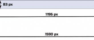
The official size of the header is 795x200px, but I recommend making the image 2 times larger. Because when loading, VKontakte compresses images, and it may become worse in quality. To prevent this from happening, we make the image 2 times larger and when loading it will be exactly what we need.
Therefore, we make the size 1590x400px.
For dimensions for the remaining elements of the group, as well as how to make an adapted cover for a mobile phone, see the article All design sizes for VKontakte groups.
Creating a VKontakte cover
To create a VKontakte cover for a group, you don’t need a lot of intelligence or effort. If you don’t have time to create a cover, and you are ready to spend from 300 – 700 rubles on creating a cover, then welcome to the Work-zilla service, where specialists in this matter will make the cover you need in a fairly short time. They will make you beautiful covers for VK.
If you have a limited budget and you want to do it yourself, then you can use an excellent service for creating beautiful banners and covers - the Canva service. This is a very convenient and free service for creating various banners for different social networks and more.
Sign up for Canva
In this article I will not describe how to create a cover there, I will give you my video instructions for creating a VKontakte cover.
Watch the video instructions below:
Where to get a picture for public
Previously, the avatar of all public pages was vertical. But due to the changes made, it is now replaced by a horizontal banner. It gives scope for activity and is more effective in terms of promotion. To achieve great success, the banner must be thematic, meaningful and pleasing to the eye. In this case, there is a high probability that the user will become seriously interested in the community and become its regular subscriber.
To design a header you need beautiful and high-quality images. It is desirable that they be unique and not repeated in other public pages. This will allow visitors to better remember the group and not confuse it with others. In this regard, the question arises, where can I get such a picture for a hat?
There are several options for where to find a picture for a public page:
- Select an image in Yandex or Google. To do this, you need to enter the text defining the topic in the search bar and go to the section with pictures. You will see a page with photos and drawings that are suitable for this topic. Among the images presented, you can choose the most suitable one, download it and install it in the header.
- Edit the downloaded image yourself using graphic editors such as Photoshop or Paint. True, for this you need to have certain skills in working in these programs. With the help of editors, you can seriously change the image, add text, effects or important information about the project to it. This way the picture will become unique, that is, not repeated on other resources.
- Use ready-made banner templates and modify them to suit your group. You can find such samples in special communities on VKontakte or on thematic websites. True, to change the banner, you also need to have at least basic knowledge of the Photoshop application. Because it is he who is used for refinement.
- Create your own original cover using Photoshop. This resource allows you to perform many functions, including making banners for groups. True, this is best done by creative people who know how to use design programs, or users with a developed sense of taste. Because when creating a cover, it is important to consider many factors such as the theme, combination of colors, images and text in the community header. What can we say about the technical side of the issue and the many subtleties that need to be taken into account in the work.
- Order a design for a public space from a specialist. This option is suitable for those who do not have the time and opportunity to design the cover themselves. Specialists with experience in this field will be able to quickly and efficiently create a suitable banner, which will also be unique. The main drawback is that it is not free. I have already recommended the KWork freelance exchange; it is also suitable for these purposes.
These are the main ways you can find the perfect picture for your public page. Most of these methods are free and quite simple. Even a novice group founder or admin can use them. If the requirements for the quality of the hat are high, it is better to seek help from a specialist.
How to make a VKontakte cover
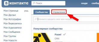
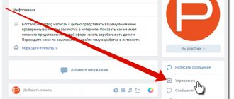
Now let's move on to the most important thing - adding a cover to the VKonakte group. In order to add a cover for a VK group, you need to go to the group itself and click on the button under the “ Manage ”
Next, go down a little lower and select “ Community Cover ” and select “ Add ”:
A page will appear in front of you where you will need to click on “ Add cover ” from your computer and select the cover you need. Next, click on the “ Open ” button:
After your cover has loaded, you click “ Save and Continue ”:
Next, a page will appear where VKontakte offers you to make a Live cover, which will change automatically, and it will look like an animated picture. If you are not going to make a Live Cover just yet, just click the cross at the top and close the window:
I will tell you how to create a Living Cover in the next article.
After you close the window, click the " Save " button in the settings and you can return to the group and check your cover.
Our VKontakte cover is ready:
How to change the cover of VKontakte
In order to change the cover of the community, move your mouse to the right corner of the cover and click on the button in the form of an upward arrow:
Now click on the “ Select file ” button and select a new cover on your computer and then click on “ Save and continue ”. After this, your VK cover will be added to your group.
A little theory
People who professionally design websites and pages on VKontakte have their own slang.
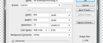
The top part of the page, which is the same for the entire site and carries general information or is present for decorative purposes, is usually called the header. A similar part at the bottom of the page is the footer. In the following narrative we will also use these terms. For example, on the pages of our group vk.com/tibimi, a header was added in order to maintain a unified design style, and the footer additionally allows you to go to the page with the menu (by clicking on the Back ):
In addition to the header and footer, illustrations can also be contained throughout the text. For example, in the example picture above, an image of our corporate hero, TBB Man, has been added.
