Hi all!
Creating a group is quite simple. The main thing is to pay attention to the little things. I advise you to seriously approach the issue of choosing a public name, and also to create a high-quality description of the VKontakte group. Formation of content and promotion of the group are the next important issues that you will have to solve. But first, you'll have to work hard to create a compelling description of your group.
What to choose, or instead of withdrawal
It cannot be said that any format is better or worse than others. It all depends on your business and the purposes for which you go to social networks. Think about it and then make your final choice. We have collected all the features of each format and made a summary table to make it easier for you to navigate.
| Personal page | Public page | Group | ||
| Who is it suitable for? | Those whose name itself is a brand: presenters, photographers, business coaches, etc. | For those who want to focus on useful content in their promotion | For those who want to focus their promotion on active communication with their audience | |
| Name | The name of a real person, written in Russian letters, is used. The company name cannot be included in the name. | The name of the community and group can include the name of the company | ||
| Menu | No menu function | You can create a menu using wiki markup if you pin it to a special publication, but then other pinned publications will displace it | There is a separate section for the menu, located immediately below the name and status in a special tab, after the pinned post and description of the community | |
| Audience gathering | Collection occurs in two ways: – adding the target audience as friends (no more than 50 invitations per day, there is a limit on the number of friends – 10,000), – the target audience subscribes to your news itself (there are no restrictions on the number) | The audience itself must subscribe to the page. You can and should use advertising to increase the number of subscribers. There are also special widgets for the site | The audience joins the group voluntarily. It is also possible to invite participants, but with restrictions: - no more than 50 invitations per day, - you can only invite those who are on your friends list. Just like in public pages, there are advertisements and widgets for the site | |
| Interaction with the audience | Communication through personal messages, through comments on posts on the wall, through comments on photographs and videos. You can give the audience the opportunity to leave notes on the wall themselves | Communication through messages in the community, through comments on posts on the wall, through comments on photos and videos. There is a discussion block, it is located to the right of the wall. Subscribers cannot leave posts on the wall themselves, but there is an option to “Suggest news” | Communication through community messages, through comments on wall posts, through comments on photos and videos. There is a discussion block, it is located to the right of the wall, but if desired, it moves to the space above the wall. You can give the audience the opportunity to leave notes on the wall themselves | |
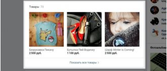
| Goods | There is a block of goods | |||
| Statistics | There is a statistics section | |||
| Additional chips | Due to the fact that a personal page is associated with a specific person, you can achieve greater trust from the audience | Additional advertising opportunity on the subscribers page in the special block “Interesting Pages” | The group can be open (anyone can join) or closed (the application for membership is approved by the administration) | |
Well, if, after reading this article, you realized that your existing community should not be a public, but a group, or vice versa, then everything can really be corrected. If the number of participants is up to 10,000, the creator himself can change the format.
VKontakte group content
Everything is more or less clear with the community sections. Now we move on to the key block, which will have to be dealt with on an ongoing basis. This is a variety of content.
In fact, all previous actions were taken to post this information. It's time to go on a long voyage! Ideal content in the VK community is 80% useful/educational/important information, and 20% advertising.
You've started creating content. Consider the following nuances:
Language availability
It's not a sin if you know how to write in beautiful literary language. But try not to complicate it with abstruse phrases and narrow-profile terminology. Write easily, sincerely, unobtrusively.
The audience does not always want to strain their brains, because social networks are created more for relaxation and entertainment.
Creating a new life, a new community
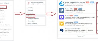
We will not consider creating a personal page, everything is clear with this, almost everyone has a personal page. Let's talk about building a community. It's actually very easy to do. Here are step-by-step instructions:
- Go to your VKontakte page.
- Open the "Groups" section in the main menu.
- Click on the “Create Community” button. It is located in the upper right corner of the block with groups of which you are a member.
- Select a community format from the options provided.
There's something on the list that we didn't talk about above, and that's the "Event" format. It is worth choosing if you are organizing a specific event at a specific time in a specific place. To promote your business, a public page or group is better suited.
- After selecting the format, enter the name (you can change it in the settings, so don’t bother at this stage, and besides, we’ll talk about the name a little lower).
- Click the "Create Community" button. Next you will have to work with the settings.
Where is it located and what is the description?
The description is located in the group header under the cover and name (the “Information” block). Even if the community is closed, it is visible to all users who open the page.
Like the “Introduction” for a book or the start page for a website, the description of a VKontakte group is its title page. Mandatory design element.
It is also worth noting that the description of a public page for search engines is the description of the page. It is easier for search engines to find a community if the abstract contains keywords.
Whatever you call the community, that’s how it will work
One of the most important elements of any community is the name; it is by this name that VKontakte’s internal search is organized and by which clients will find you. Of course, the size of the community and its activity are also taken into account, but to a lesser extent, the name still remains the main factor. Therefore, it must contain a key that reflects the activity you are engaged in: “Online home textile store”, “Sewing workshop”, “Design studio” and so on. In addition, the key in the name will allow you to optimize the community for the wider Internet. The question arises: how to choose this key? Everything is very simple:
- Analyze your competitors' communities in search and see how their names look. If it’s good (the community is promoted according to a specific key and works quite successfully), then it can be made in the image and likeness, for recognition among the target audience.
- See which titles have the lowest competition in internal search to make it easier to get to the TOP of search results.
- Check the additionally selected key through Yandex.Wordstat. If a key has a lot of requests, then the likelihood increases that people will also enter it in VKontakte’s internal search.
We've decided on the key. Do you also want to insert the name of the company itself into the name of the community? Why not, but it’s better to do it after the key, because it should come first and without diluting it with other words: “Sewing workshop “Handlewoman”.”
If you work for a certain territory, for example, for a specific region, then it is better to indicate this too: “Rent apartments in Moscow”, “Organization of weddings in St. Petersburg”. It will help to weed out unnecessary audiences at the entrance.
But it is important to remember that the name is a laconic phrase. And VKontakte will not let you go wild, even if you really want to. The maximum length of a community name is 48 characters.
Don't forget about coherence. Names like “Custom Dresses Chita Rent Inexpensively” contain both a key and a link to the region, but do not inspire confidence at all. And if you are afraid that without the exact entry of the key, the search will not return you at the client’s request, then you can exhale. Machines have long learned to understand declension by numbers and cases.
Clinging parts
The news feed of active users is overflowing with content for every taste. You must stand out from the crowd and be well recognized. When scrolling the feed, the user pays attention to post elements such as the title and image.
Publish original, unique and original content. Look for or create something rare, special. If you use pictures from the Internet, make sure they are up to date. Want to add a meme? Do it! But he must be at the peak of his popularity. Seals? No problem! Choose a good photo.
URL: words are better than numbers
Another important point is the community address, that is, the URL. By default, when creating, you will be assigned a specific numeric ID, but we recommend replacing it with a CNC (human readable address) in the settings. That is, one that contains real words that are directly related to your business. And by the way, an important detail. Do you have a Web site? Then duplicate the name of this site in the community URL, so that in a large search for a branded query, both will come up. This will increase your company’s recognition and make it easier for customers to remember your name.
The first word was eaten by a cow: why is it important to give community status?
Status is a place immediately below the name where you can place up to 140 characters of text. Very often, for some reason, the status is either completely forgotten or some kind of philosophical quote is written in it, and often this quote is not even related to business. The community is not your personal profile; this is inappropriate here. Moreover, the status may contain other important information that will make your business more efficient. Here are some options:
- USP (your advantages: record-breaking fast delivery, free consultation, etc.);
- telephone or other contact information;
- website address, if available;
- information about current promotions and discounts.
So don't waste space. In the status, we also recommend once again placing the key by which you are moving. And please do not use the Caps Lock key when writing, this bothers many people because they feel like they are being shouted at, and it’s just harder to read. =)
Discussions - a platform for communication
Social networks are about communication. Give people a reason and space to do this. Discussions are a great tool for communicating with subscribers and providing feedback.
Why are discussions needed?
- Collecting reviews
- Collection of questions
- Collection of orders
- Useful information, for example, about promotions (photos, videos, audio)
- A platform for communication between subscribers (so as not to clutter the news feed and comments under news with conversations on other topics)
My light, mirror, tell me and tell me the whole truth!
The description, along with the name and status, makes up the so-called community header. Ideally, this includes design, but this is a separate block, which we will talk about in more detail in the next article. When a person enters your community, the first thing a person will look at is the header, so all the basic questions should be answered there.
The description will help to expand in detail what is already indicated in the title and status. Tell me truthfully:
- About company;
- about your activities;
- about competitive advantages;
- about the intricacies of work (delivery, ordering, prepayment, promotions, etc.).
Important ! Be sure to include contact information in the description or explain where they can be found.
Description is the same selling text. Looking at it, the client should at least become interested, and at maximum, take the targeted action. Here are some tips to make it as attractive as possible:
- Start by describing the client's problem that he can solve by contacting you. Or with a description of the bright future where the client will go after using your services. And the more colorfully the problem (and its solution, of course) or a bright future is depicted, the better. For example, problems: you have a headache, a tooth has fallen out, you have nothing to wear on a date in the evening. And a bright future: if you want a slim figure, your wedding will be the most elegant, you will receive a bouquet of the freshest flowers, etc.
- Avoid cliched phrases like “highly qualified specialists”, “reliable guarantees”, “unsurpassed quality”. Write simpler, more specific. Good specialists? Provide a link to their certifications or talk about their professional achievements. Reliable guarantees? Promise to return money if the product breaks within a week/month/year after purchase. Unrivaled quality? Share a list of suppliers or explain what materials you use and why they are the highest quality.
- Write not about your advantages, but about the client’s benefits. That is, we don’t praise ourselves, but tell them exactly how your company will help a person. Not “we can,” but “you will receive,” not “we have,” but “you will find.”
- Complete the description with a call to action: call, get a consultation, write, buy.
- Insert into the text the key that was used in the title or status, if possible. The main thing is that it looks natural. And I remind you that the community is optimized under one key. No need to write a list of keys. This will still not give results in promotion.
Links
Share links to your website, accounts on other social networks and links to other useful sources in the “links” block. It’s sad to see in groups a link to Instagram with the caption “Our Instagram!” or without a signature at all. What's your Instagram? What should I do with it? Why go there? It is important to label these links in a way that generates interest. This can be done with a short description and call to action. For example, “choose from a convenient catalog on our website.” Short, useful and understandable.
Let's sum it up
Today we covered a lot of useful things:
- learned what formats of communities there are on VKontakte;
- clarified how they differ from each other;
- understood how to create a community;
- We figured out how to design its header: name, URL, status and description.
Next time we’ll talk about another very important component of any community - about design, which, by the way, means not only an avatar. But let's keep the intrigue for now. And that’s all for today, if you have any questions, write in the comments, we will definitely answer!
By the way, you can order all work on the community, as well as an audit of an already operating public page or its re-registration (and not only on VKontakte) from us. =)
Formation of a VK group
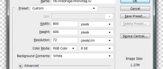
Are you puzzled over what is better to choose – an avatar or a cover? Now you will understand why the cover is the most successful option. There are reasons for this:
- The cover is beautifully positioned around the entire perimeter of the header. This adds aesthetics and appeal to the community. Of course, if the cover is made well.
- You can indicate a lot of different information on it, and this text will not dazzle your eyes, as usually happens with an avatar (when an entire dissertation is written on a small image).
- The avatar will remain in the group and will appear in the thumbnail. By clicking on the avatar, the user will be able to look at it up close.


