Guide to buttons with calls to action on VKontakte
Buttons with calls to action in VKontakte ads: your new weapon for high conversions
Are you placing an advertisement in the VKontakte news feed and want to know how to get more applications, calls and subscriptions for the same money? Or maybe this tool has not yet been used and you want to use it as effectively as possible at the start?
In our first post we will talk about the recent innovation of VKontakte. It allows advertisers to get much more value from placing paid ads in the news feed. This new tool is active buttons in ads or CTA buttons (call to action buttons).
Considering that today the only payment model for promoted posts on VK is uCPM (money is debited as per 1000 impressions), the new feature will help you get much more requests or calls with the same budget. According to representatives of the social network, even 3 times. Well, let’s take the word of VKontakte development director Alexander Kruglov, who bases his statement on internal tests of the social network.
So, what do “Buttons” do, what are they, and what tasks of your business will they help solve much faster?
Starting from November 16, active buttons can be added to promoted posts (in the news feed they are marked as “Advertising post”): “Buy”, “Go”, “Install”, “Join”. In addition, there are more than a dozen options. The choice depends on your cherished goal - to get referrals to an online store, direct a potential client to a dialogue with the community administrator, or even force them to dial your number directly from the VK mobile application. The buttons are displayed not only on the desktop, but also in the mobile version and in official VKontakte applications.
The biggest advantage of the innovation is your ability to force a potential client or subscriber to take the action you need quickly and without unnecessary steps: if you want sales, direct them directly to a product or service; if you want registrations for your seminar, write a link to the registration form; if you want more subscribers, invite users to join your community in one click. Don’t force the user to think, study your materials unnecessarily, reduce the time for making a decision and get much more leads: subscribers, calls, contact information or instant sales. It is important that the tool will help optimize the budget: we pay not for applications and clicks, but for ad impressions in the feed.
For your convenience, we have made this guide on VKontakte CTA buttons. Find out which buttons are best to choose based on the objectives of your advertising campaign and the conversion goals you want to achieve.
You can download this manual in PDF format from the link: checkboxes_cta_to_vk_pdf
What to pay attention to when setting up CTA buttons?
Now, after we have decided on the goals, types and texts of buttons, it’s time to move on to setting up a CPA campaign. It is worth noting that there are a number of nuances here, so we decided to tell you about them.
We won’t dwell on targeting settings and choosing bids; let’s move straight to working with the advertising record.
So:
- Go to the advertising account (section “Targeting”) and select the advertising type “Record in the community”. VKontakte will offer us to create a new post or select a ready-made one. However, you can only advertise the entry of the community whose administrator you are.
By the way, not many people know that you can promote posts on VKontakte without publishing them in the community (hidden advertising posts). They will only be seen by the target audience of the advertisement, and they will not be displayed on the community wall or in the news feeds of subscribers.
2. Let's say we already have a post that has proven itself well virally (that is, it received a good response from subscribers without advertising). Copy its link into the window and open it for editing.
3. Click on “Add link” (third icon under the advertising post) and enter a link that should be relevant to the target action we expect. In our case, this will be a transition to dialogue with the community. Save and move on to the next stage.
4. Here “VKontakte” will ask us to choose the text of the button: “Write”, “Contact”, “Join”, “More” or “Go”. It is important for us to invite the user to chat, so in our case we select “Write”.
5. Click “Save”. But that was not the case, VKontakte will ask us to remove all links from the ad text. There can be only one link - the one that will be written in the button.
6. Save. And again we fail: the text is too long. VKontakte allows us only 220 characters.
7. We mercilessly cut the post, leaving only the most important things. We try to save again without success - two line breaks are not allowed.
8. After the correction, we encounter another problem: we will have to discard the attached image. Instead, there is an option to insert an image for the link. Its dimensions should be 537x240 px - this is smaller than the usual image formats for posts.
9. Hurray! Finally, the ad complies with all the rules, and we can run it, anticipating a flood of messages to our operators.
Well, VKontakte turned out to be quite strict regarding the CTA advertising format.
We summarize the general requirements for advertising materials for this type of ad:
- There should be no links in the ad text itself.
- The maximum number of characters is 220 characters.
- More than two line breaks are not allowed in an ad.
- Attachments are prohibited. It is acceptable to add an image for the link with a size of 537×240 px.
And these, in our opinion, are essential technical requirements for all promoted VKontakte posts. On a note:
- You can only promote posts published on behalf of a community that you are an admin of.
- You cannot advertise recordings of closed or private groups or private events.
- Only one advertisement can be created per record in the system. Tricks of spreading identical ads across different advertising accounts won’t work either.
We wish you effective advertising campaigns and more quality leads!
And be sure to test “Buttons”.
Your Checkboxes
spark.ru
Action Button Statistics
Is it possible to find out how often users use the action button in our community? This is very easy to do - just look at the group statistics:
After opening the community statistics, go to the “Activity” tab:
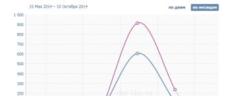
The bottom graph in the “Activity” tab will show the statistics of clicks on the action button:
Experiment with call to action in your button. Try different options and see how your subscribers will react to certain actions. Analysis of statistics will help you understand whether you chose the right action.
In this simple way you can install and configure an action button in your VKontakte community. If you have any questions, ask them in the comments. I'll be happy to answer.
Tags: VKontakte business, How to sell from a VKontakte group, action button in VK, VKontakte promotion, VKontakte community
How to make a VKontakte clickable button on a YouTube video
Hello, friends! From this article you will learn how to make a VKontakte link to a YouTube video in the form of a clickable button. This button will send your news readers directly to your video channel. You can’t do it just like that, but by using the described method, you will do the impossible on VKontakte.
At the same time, we can say that the person will conditionally remain in your group at the same time. You may say: “Why have a button if you can just post the video on your wall or in a group?” Indeed, this can be done, but all the laurels from the videos watched will mainly be taken by the contact. But the button already 100% guarantees that the number and time of viewing will be counted using YouTube tools. This is an important fact considering that since the beginning of this year, in order to become a YouTube partner, you need to gain at least a thousand subscribers and 4,000 hours of viewing.
If we talk about the benefits of such a button directly for promoting VKontakte, it lies in the fact that you can provide a link to your video in a variety of variations.
As you can see, this is not a banal repetition of the same title image of your video in your news feed. In this case, there is a place to roam, dream up and ultimately achieve your goal.
With any other site except YouTube, it would be possible to make this button as written in this article of mine . By and large, the algorithm of actions has not changed at all, but Contact itself is rearing up in relation to YouTube videos and, as a result of seemingly logical actions, will still display the video in the form it usually does.
However, you can force the contact to change his attitude towards the YouTube link using an ordinary redirect. In this case, the redirect will act as an intermediary.
To create a clickable button, you can use at least four types of redirect. I will focus on the first one, as the simplest and most accessible for any Internet user. Why I chose the bitly.com link shortening service for this method will become clear to you if you read this article with the comparative characteristics of link shortening services.
The entire process of creating a VKontakte post with a clickable button can be depicted with this diagram:
In short, you take a link from your video, shorten it in a link shortening service and paste it into the VKontakte news adding window. VK will show you a video preview, where by clicking on the camera icon you can replace the displayed preview with a button image.
You can see how this is all done in practice in this video.
Subscribe to my video channel and watch other videos
You see, the process is not complicated. Links to all necessary services and additional videos are in the video description directly on my channel. The only thing that can cause difficulty is the process of creating the button itself. In fact, it can be done in any graphic editor, not only in Photoshop. Here's a template for you. Its dimensions are 537x240 pixels.
You can download the picture by right clicking the mouse
Your task is to fit the button on a white background.
There is no need to crop the image. Just make a button and then when you insert it, don’t adjust anything either. There will be no gray background after publication. Here you can download the button template in PSD format .
The template has three ready-made button options. You can easily correct them or turn off their display and do something of your own. If so, ask questions in the comments. The technique is the author's, so you will be pioneers in the placement of such tricky buttons. Now you have an excellent opportunity to promote your YouTube videos on VKontakte without boring your friends and guests with the same thumbnails of your video.
Best regards, Sergey Pochechuev
DID YOU LIKE THE ARTICLE? TELL YOUR FRIENDS!
prostodelaytak.ru
How to make a “subscribe” button on VKontakte?
Many VKontakte users are annoyed by constant friend requests from strangers. Alerts about them will be displayed until the person accepts or rejects the application. Few people know that the site developers offer a solution to this problem using a single option - the “Subscribe” button.
Why is it needed?
With the help of simple manipulations, the owner of a VK account can replace the “Add as a friend” button with “Subscribe”. It will be seen by unfamiliar visitors to your page. By clicking on it, you will receive a notification that the user has been added to your subscribers. In your free time, you can decide which of them to add as friends.
A person who subscribes to your page will have access to the information that you allow all VKontakte users to see in their privacy settings.
How to connect
For the button to start functioning, log in to your VK account and follow the instructions:
- On your account page, click the downward arrow next to your profile photo thumbnail;
- In the drop-down list, click on the “Settings” section;
- In the menu that opens, go to the “Privacy” tab;
- Open the “Contact me” block and allow notifications about incoming requests only from friends of your friends.
You can check whether the specified actions have taken effect as follows:
- In the settings, open the “privacy” section, click the “See how other users see the page” link;
- In the drop-down list at the top, select “Unfamiliar user”;
- If everything is done correctly, the button will appear instead of the “Add as a friend” icon under the profile photo.
And here you can see whether strangers see the basic information of your page, images and geotags, a list of communities, audio recordings, and a list of gifts.
If this information is open to all users, then changes will be available to people who are subscribers. For example, they will see a post about adding photos in their news feeds.
In Group
If you are a community administrator, you cannot install a “subscribe” button in it. Users will only be able to apply to join. But on the official pages - you can. Therefore, if you want to expand your audience in this way, simply change the group settings, making it an official page.
tvoyvk.ru
Installing a subscription button in the VK welcome widget
Hello! The previous article talked about how to install a greeting widget for a VK group. You already know that you can add a button with a link to the welcome widget. And some group owners have a question about how to create a subscription link through the welcome widget. Simply put, how to link a welcome widget with the VK Subscribe button.
Unfortunately, it is not possible to add a subscription button to the widget, which would allow you to join the group in 1 click. This is only possible through the wiki page. Before you start studying the material, I recommend reading an article on a similar topic: How to create a post through the VKontakte wiki page.
To avoid any questions, I will show you the whole process step by step on how to link the welcome widget with the VKontakte Subscribe button.
Designing a subscription image in Photoshop
After a potential subscriber to your community clicks the Subscribe button in the welcome widget, a new window should appear with additional information. This is implemented through the wiki page. To make it beautiful, let’s make the form in the form of a picture.
If you want to learn how to work professionally in Photoshop, I recommend taking training for beginners from Zinaida Lukyanova. Details at this link >>>
In Photoshop, via File – New, set the dimensions for the workpiece. For me, the best option was a picture size of 550x220 px. You set the sizes only at your own request. The rest of the settings are default. See screenshot:
Now fill the transparent background with white. In the left menu, set the main color to white and click on the Fill tool. Clicking on the background makes it white.
In my example, I will put the group logo on the left, and on the right I will add some text and a Subscribe button.
I assume that you have your group’s logo saved on your computer: just drag it with your mouse into an open Photoshop program, and then onto the template. If you need to enlarge or reduce the picture, do it through the Edit – Transform – Scaling function. It is important that the picture does not change its proportions: to do this, first hold down the Shift key on the keyboard.
Once you've added your logo, create a new layer and turn on the Horizontal Text Tool.
In the top panel you will have access to settings for text: font, font size. You can experiment, or follow my example.
Now all that remains is to add the Subscribe button to the template. You can find it through Yandex pictures on the Internet. Copy with the right mouse button and paste into the program using the keyboard shortcut Ctrl+V. The size of the button can also be edited using the Transform function. Result:
To intrigue a potential subscriber and capture his attention, you can come up with your own version of the picture. Using Photoshop, you can create similar blanks, both round and square, with different backgrounds and text - whatever your imagination allows you to do.
Connecting wiki markup in a group
If you have never worked with wiki markup, you must first enable this function in the group. Community Management - Sections - Materials (limited).
Now notice that a new Latest News tab has appeared in the group next to Information. And it is editable.
Subscribing via the VKontakte wiki page
After clicking on the Edit button, you will see a blank wiki page called Latest News.
In wiki markup mode (and it is connected through the corresponding icon on the right <>), enter a name for this form. For example, a welcome widget. Important! The word or phrase must be enclosed in double square brackets: [[Welcome Widget]]
Look at the screenshot:
Next Preview. If you did everything correctly, the link below will be active. Click on it to go. But before that, save the page.
Fill with content.
At this step, we had the opportunity to add a ready-made image for subscription to the page. This is done through the toolbar – Add a photo.
If you have a visual editing mode enabled, the image will be displayed on the tab. In my case, it downloaded in a compressed size. If you want to fix this, just click on the picture and set the original dimensions.
Now you need to switch to wiki markup mode: click on the <> icon.
A code will be displayed in which you need to insert this link https://vk.com/widget_community.php?act=a_subscribe_box&oid=-idgroups&state=1
Be careful: the link is inserted before the closing square brackets after the forward slash. There is an extra space here - it needs to be removed. Just don’t delete the characters: your form won’t work that way.
Please note that in the link, part of it is presented as an id group. It needs to be replaced with the digital id of your community. It is displayed in the browser bar.
Copy this code and replace it in the link. Each group has its own id.
As a result, you will get the following:
Below, click Preview and click on the finished image. If you did everything correctly, you will be redirected to a subscription form with an active Subscribe button. Don't forget to save the page.
Adding a Subscribe button to the welcome widget
Before closing the wiki page, copy the entire link from your browser.
Now this link needs to be added as a new post to your group. It may not look very nice, but then the post will go down due to the new content and will not be visible. This is necessary so that after clicking on the Subscribe button of the welcome widget, a pop-up window with a form appears, rather than opening a new tab.
Open this post and copy the entire link from your browser again.
All you have to do is add a subscribe button to the welcome widget.
To change a button, click on it and make changes to the fields. In particular, change the link to the one you copied from the browser bar, and change the name of the button, for example, to Subscribe.
Install the widget. If you already have it installed, confirm the update.
The Welcome widget now displays a Subscribe button.
When you click on it, a group visitor will be redirected to a form asking you to subscribe in the form of a picture, and then to a window with a subscription.
This is how you can link the welcome widget to the VKontakte subscription button. I wouldn't say it's very convenient. Implementing a 1-click function for subscribers would be more comfortable. However, this is another way to attract new members to your VKontakte group.
If you have any questions while studying the article, I think that the video lesson will “dot the i’s.”
Streams of money
denezhnye-ruchejki.ru
What has been done regarding the original v11.80?
- Updated keyboard restrictions (in accordance with API changes):
- no more than 5 buttons per line (previously 4);
no more than 10 and 6 lines for standard and inline representation, respectively (there were 10 in both);
- Default button renamed to Secondary.
- Added callback buttons:
- new event type “message_event” (click on a button);
new method “create callback button”;
- added example (animation of work and code will be given below).
Buttons in advertising posts of the VKontakte group
Using buttons that offer to perform some action helps improve the effect of advertising posts.
There are different calls to user action, the choice of which will depend on the type of advertising being used. The button can link to any Internet resource, group, application of the group or the VK site itself, which will allow you to quickly contact the administration.
What are the benefits of buttons in advertising posts?
Such a button immediately attracts the attention of a potential client, is a link to a specific page of the site, group, application of the group or VKontakte site and to the messages of the group that is being advertised. For ease of communication with representatives of the company whose advertising is posted, users of the mobile version of the site can use the convenient “Write” or “Call” buttons.
This functionality can significantly affect the promotion of the VKontakte community .
Link to website or application
Buttons linking to the site help attract audiences to the Internet resource of the company that posted the advertising post. Group visitors can be redirected to the community or site app. The button can also link to group messages, which will allow you to conduct a dialogue with the administration.
Actions that buttons can perform:
- follow the link assigned to the button;
- open a new page;
- purchase tickets or any goods;
- send to the page with the questionnaire;
- provide the opportunity to subscribe;
- open a dialogue with the administration.
Link to social group networks
Buttons that link to a group on the vk.com website allow you to visit the community page, get acquainted with the basic information located on it, and go to a dialogue with the group administrators.
Thanks to the “join” button placed directly in the ad, you can easily attract new members to the community to which it links.
Actions of buttons-links to the VK group:
- become a member of the group;
- communicate with the administration;
- follow the link;
- find detailed information;
Button with company phone number
Pressing the button with the number launches the “Phone” application on the smartphone and makes a call to the specified number. Thus, a potential client can quickly contact the company and place an order.
The phone number button allows you to:
- make a call;
- book a product or service;
- sign up or register.
Appearance and functionality of the buttons:
- picture with a resolution of 537x240;
- a small snippet title, from 70 to 140 characters long;
- text with two line breaks, up to 220 characters in total;
- the name of the button corresponding to its intended purpose.
The procedure for adding a button to an advertising post
1. Log in to your social advertising account. networks and create new advertising:
2. Select “Community Post” as the format:
3. In the recording settings section, select “Create recording”:
4. Decide on the group on behalf of which the entry will be advertised:
5. In the new window, click “More” and select “Button” from the list.
6. Decide on the target action and enter it (add a link to a website or group, or enter a phone number).
7. select the required button.
8. Make sure the format is correct and click “Create”.
online-vkontakte.ru
Run long poll
Let's start the action. If the user sends a text message, we display the first menu. If this is a “click on the callback button” event, we perform a certain action (one of the 3+1 actions mentioned above).
f_toggle: bool = False for event in longpoll.listen(): # send the 1st type menu to any text message from the user if event.type == VkBotEventType.MESSAGE_NEW: if event.obj.message['text'] != ": if event.from_user: # If the user's client does not support callback buttons, # clicking them will send text messages. Those. they will work like regular inline buttons. if 'callback' not in event.obj.client_info['button_actions']: print(f'Client {event.obj.message["from_id"]} not supported. callback') vk.messages.send( user_id=event. obj.message['from_id'], random_id=get_random_id(), peer_id=event.obj.message['from_id'], keyboard=keyboard_1.get_keyboard(), message=event.obj.message['text']) # process clicks on callback buttons elif event.type == VkBotEventType.MESSAGE_EVENT: # if this is one of the 3 built-in actions: if event.object.payload.get('type') in CALLBACK_TYPES: # send instructions to the server on how to process which button. This is included in the # payload of each callback button when it is created. # But you can do it differently: put your own # button identifiers in the payload, and here use them to determine # what request should be sent. The first option has been implemented. r = vk.messages.sendMessageEventAnswer( event_id=event.object.event_id, user_id=event.object.user_id, peer_id=event.object.peer_id, event_data=json.dumps(event.object.payload)) # if this is our “ custom" (i.e. without a built-in action) button, then we can # edit the message and change its menu. But if we wanted, we could # open a link/application or show a pop-up on this click. (see animation below) elif event.object.payload.get('type') == 'my_own_100500_type_edit': last_id = vk.messages.edit( peer_id=event.obj.peer_id, message='ola', conversation_message_id=event .obj.conversation_message_id, keyboard=(keyboard_1 if f_toggle else keyboard_2).get_keyboard()) f_toggle = not f_toggle if __name__ == '__main__': print()
How to put a VKontakte button
Today we will consider the question of how to add a VKontakte button to your website. You don't need advanced knowledge of javascript and PHP to do this. It is enough to take clear steps step by step. Why do you need to add a button to your website? You might wonder. We will answer you - the fact is that the social network VK.com has an audience of millions of visitors who may also end up on your website. If you think in advance about making the site at least a little known to VK visitors. We've all heard about word of mouth, so when a visitor lands on your website, he presses the “like” button for contact and thereby triggers the same word of mouth effect.
Now that we have figured out why the “like” button is needed on the site, let’s start installing it.
Step one. Go to the vk.com website using the following link https://vk.com/dev/Like. You will see there a window for connecting the “I like” widget we need. In this window that appears, you need to fill in all the fields.
Step two. In the field called “site/application” you need to select the site that will be added. If the site you need is not in the list, you need to add the site to this list (see figure below). Carefully fill in the fields when adding a site, its name, main domain, address.
Step three. Select the button option that you want to see on your site; usually choose the one that is more similar to the design of the site on which the widget will be. You can change the button at any time. Once you have decided on your design choice, select the button height you want. You can see at the bottom of the screen what the widget will look like - under the field called “insertion code” (shown in the figure below).
Step four. Copy the code from the box that says “embed code” to your website. The code is inserted into the site in two places. Part one of the code is inserted into the “head”. The other part of the code (the second) is inserted into the place where the contact button should be displayed directly. To insert this code into your website, you need to make changes to the template. The template will be located in completely different directories, it completely depends on which CMS you are using. For joomla, look in the templates directory, if you have WordPress then look in the wp-contentthemes directory, but if you have a DLE site engine, you will find it in the templates folder. If suddenly you cannot find the file you need to make changes to. Then open the page on the site where you want to install the VK button and explore its source code (use the key combination CTRL+U). Select part of the template (HTML tags) and use contextual search in various site files (via FTP, of course). Otherwise, contact a programmer to help you.
Step five. Check the result of all the above steps. What does “I like” look like on your website?
Finally, it is necessary to mention that this widget is not the only one on VKontakte. Among the newest is a widget called “subscribe to the author.” This widget in some moments is even more useful than the like button.
vk-proga.ru
How to add a “Subscribe” button on VKontakte?
When a user visits our page, under the avatar he sees the “Add as friends” button (see hidden friends in VK 220). This way, anyone can send you a friend request.
But what if you don't want anyone to be able to do it? You can put a “Subscribe” button. Users will only be able to subscribe to your page (see how to remove from subscribers in a contact).
Now I will show you how to add a “Subscribe” button to VKontakte.
Subscribe button
Initially your page looks like this.
There is a button “Add as friends”. Let's change it.
Let's go to settings.
Here we open the “Privacy” tab. In the “Contact me” section, find the item “What friend requests are notified about” (see how to turn off VKontakte notifications).
Set this to “From friends of friends”.
All is ready.
Let's check. Go to the very bottom of the page and click on the link “See how other users see your page.”
You will see your page in the form in which your guests see it (see trap for VKontakte guests).
As you can see, the Subscribe button is now displayed. So we succeeded.
Video lesson: how to make a “subscribe” button on VKontakte
Why do you need an action button in a community?
It's actually simple. Just one click - and the client calls, writes, books, registers and buys!
Remember, friends, our task is to simplify our interaction with the client to a minimum.
Do you want your sales to grow? Use the golden rule: “The simpler, the better.”
Look at how the action button is implemented in the community of the KSK Free Wind riding school|pony club|Ekaterinburg.
Project manager Lyudmila Mineeva shared her impressions of how the Home button worked in her group:
