Rules for creating a VKontakte group
The process of creating a VKontakte group is as follows:
- Log in to VK;
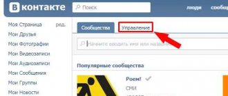
- Go to the “My Groups” section in the left menu and click on the “Create Community” button;
- Enter the name of the community. Important rules for choosing a name are originality and the use of keywords for the query by which you intend to promote your group;
- Select the type of group, select the topic in the drop-down list and click on the create button;
- Next, you need to fill out a description of the group, it should be easy to read, simple text with organically inserted keywords;
- Choose a group URL with thematic words and as short as possible (so that it is easy to remember);
- Indicate the address of your site (note that VK may not redirect to some domains, but issue a warning to the user about the danger (for example, free hosting or domains). To bypass this “pad” it is best to use a new domain *.com, *.ru or https://goo.gl/ and similar services with a high reputation). We recommend reading the article about redirects for VK.
- Next, you should specify an avatar. This could be a thematic picture or a photo of the product that you intend to advertise. The main thing to remember is that this is a small picture, so you don’t need to overuse small details.
After saving the changes, the group is created. Now you have to develop the community, invite participants, fill the wall with information, perhaps engage in mass following or mass liking.
Rule one: Everything depends on the topic.
You will say: “Well, it’s already clear that it’s popular and should be done, everything is simple,” but in fact, this is the intrigue of choosing a public topic. It’s like a double-edged sword; you can choose a popular topic, which, if properly promoted, will begin to generate income, or you can create a public page with an emphasis on the future and gradually develop it.
And, not surprisingly, the first case is less workable, because everything popular has already been taken apart, which means it will be very difficult to “break off” a piece from the overall pie of visitors.
My advice: Create a public page with an eye to the future, but if you feel strong enough, create a public page on a popular topic, however, your chances of success will tend to 0.
Where to get ideas for creating a VKontakte public page
This social network has not only millions of users, but also hundreds of thousands of communities. There is only one way to win the competition for the audience over competitors - to offer users interesting and unique content. Therefore, the creation of a VKontakte public should begin with an original idea. You can find it by reading discussions in other communities with a large audience - what users care about is what they write about. Each option is worth checking using Google Trends, starting with large trends and paying attention to the “Related queries” block.
When working with affiliate programs, it is wise to start from those offers to which you are going to send traffic. For example, if you are going to make money from gaming offers, then you need to create a community for gamers. If you intend to sell DVRs, create a group based on a popular car brand or automaker. For any topic of the group, you should not copy other people’s materials, but offer users something new and interesting, then they will become subscribers.
General principles for writing rules for VK groups
The style of writing the rules must correspond to the style of the community itself. It is better if a greeting is placed at the beginning for all visitors, which is designed to make a first impression not only about the public, but also about the administrators working in it. Next, you should succinctly and clearly describe all the norms of behavior in the community, defining actions that entail sanctions from moderators. And in the end, so as not to scare away potential participants with your own severity, you can wish them pleasant and productive communication.
Attention! Rules can consist of one or several blocks, when communication rules are prescribed for each user group. In addition, blocks can have the format “The Participant is obliged...”, “The Participant has the right...”. It is also allowed to write Rules for each section of the group: “Photo Section Rules”, “Video Section Rules”, “Posting Rules”, etc.
Setting up a VKontakte group
A well-designed community builds trust among visitors and attracts them to join the group and communicate. Since the structure of the page in this social network and the fonts are strictly defined, you can influence the appearance of the public by choosing the right graphic elements and providing the group with a beautiful menu, which is discussed in the next section.
The following images are used for VKontakte design:
- Avatar, picture located at the top right of the page. Image size 200x500px (other sizes are possible, but the aspect ratio must be 2:5). The thumbnail that appears in post headers and on mobile devices has dimensions of 200x200 pixels. When uploading a large avatar, the system will prompt you to select a fragment for the thumbnail. This thematic picture is the first thing the visitor sees. You can place a logo or inscriptions on the image. But it should be taken into account that the text must be large enough to be read from the thumbnail and not extend beyond its edges. To upload an image, move the cursor to the picture (or empty block) in the upper right and click on “Update Photo” or “Change Thumbnail”.
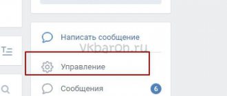
- The cover is a new and important design element that appeared after the VK redesign. This is a horizontal image of 1590x400 pixels located at the top of the page. Due to its size, you can place the name of the group on the cover, briefly describe the topic, and indicate the address of the related site. If there is a cover, the large vertical avatar on the right is not shown. The cover is loaded in the group settings. In the action menu, select “Community Management” and click on the “Download” link next to the “Community Cover” inscription.
- A picture of the menu, which is published in the attached wiki page or the “latest news” section. Unlike the avatar and cover, which are ordinary images, the menu image consists of button fragments, for each of which you can assign links. The overall width of the menu image should be 510px. If you want the bottom edge of the menu to match the vertical avatar on the right, the menu height should be 308px.
- Images in publications: width 510 px, height up to 510 px. Pictures for posts play a big role in attracting attention. There are many artistic techniques aimed at enticing a visitor to read a publication. You can use bright, rich images, or vice versa, darken the picture and write text, interesting facts, or a call on top. A combination of a high-quality photograph and an area with a contrasting color on which the inscription is made (for example, a headline, an interesting fragment from a message) looks good.
The group will look nice if the vertical banner of the avatar and menu or the cover and menu are parts of the same image. Ideally, all elements: avatar or cover, thumbnail and menu should be made in the same style, with the same color scheme, fonts, and logos.
When loading graphic files, VK automatically compresses the image, which leads to its distortion and the appearance of pixels, especially on a dark background. There are two options to solve this problem:
- The official one from VK is to save the picture in a graphics editor in the “for the Web” mode, always in 100% quality and with the “Convert to sRGB” option enabled.
- Practical, from experienced SMM masters: avoid dark backgrounds and upload an image with a resolution 2-3 higher than required (for example, not 200x500, but 600x1500 pixels).
There are several approaches to designing the top of a community page. You can place a beautiful cover and below - a pinned post with text and a link to the site (or tracker). Or the public administrator may not pin the post or load a horizontal header banner, but immediately show visitors the text of information about the community in the hope that after reading it, the user will immediately go to the site. This approach is more suitable for public advertising of one single product.
If the public is on a broad topic, and you are counting on collecting and retaining a regular audience, then it is better to place advertising less noticeably in the form of reviews or small messages between regular posts with useful information. And in the attached message at the top, make a group menu for easy navigation.
The entry point to the menu in the public may also vary. Either the menu items will be immediately visible in the pinned post, or the top post will contain a beautiful image, an enticing call to action, and an “Open menu” button that will direct you to a separate page where wiki markup will be used to navigate the sections.
How do you create communities in VK?
101 votes
Hiring a designer myself
Rule two: Create a public page (public), not a group.
I won’t write much here; I’ll turn to statistics.
Let's take popular communities, the iFace public and the FFFUUUNNN group, both projects on the topic of humor and comics. Statistics:
Comparing the founding date, the number of users and the average number of likes per post, you can understand that groups are becoming obsolete, and public pages, on the contrary, are taking their place in the sun.
But, in truth, usability, in other words, ease of use, played a role here. After all, using public pages is much more convenient than opening a cat and looking for your group. These split seconds, which seemed like an instant, played a cruel joke on the groups and drove them into the grave. Therefore, do not reinvent the wheel, make a public page.
How to create a menu for a VKontakte public page
Having a beautiful menu is one of the rules for creating a VKontakte group. This is an important design element that represents an attached wiki page. The menu provides convenient navigation through community sections and gives the group individuality, a unique design, and helps to stand out among competitors.
The community menu can be very simple, if it is a header image and a list of links, then you can design all this using the visual editor of wiki pages. In order to create a more beautiful menu, you will need to work with a graphic editor and manually format the page.
In order for your public to receive a unique graphical menu, you need to complete the following steps:
- Think over the structure of the community, make a list of menu items;
- Create pages or sections to which menu items will link and record links to them;
- Select an image for the background (for example, from free photo stocks);
- Open the background image in a graphics editor and write menu items on it in the required positions;
- Using a graphic editor (the “Slice” tools in Photoshop, the “Guillotine” in Gimp, the grid + magic wand in Paint.net), you need to cut the picture into parts (each menu item is a separate fragment);
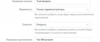
- In the community, go to the “Community Management” item, select “Sections” in the menu on the left and select “restricted” in the “Materials” item (this means that only administrators can edit the menu);
- Upload pictures to the group;
- Create an attached Wiki page in the public (in the group, go to the “Latest News” section and click “Edit”);
- Create a menu structure using wiki markup.
Rule three: You only need targeted visitors.
I hope this is also clear, but some people neglect this and lose their money.
Remember: any type of acquisition of public subscribers is an extremely ineffective activity, because in this case, visitors are indifferent to your content, they are only interested in the money that you pay them for joining. This layer of subscribers will be dead weight in your group, and you will be surprised at the small activity of the public, and therefore at the small income.
Therefore, forget about services like V-like.ru or Vktarget.ru, these are not for you. Your goal is to popularize your public page among the masses through word of mouth. That is, attracting targeted visitors and future active subscribers by the method of real recommendations from people when they click “Share” or “Tell Friends”.
Therefore, make the public interesting, so that they not only want to come back to you, but also recommend you.
